

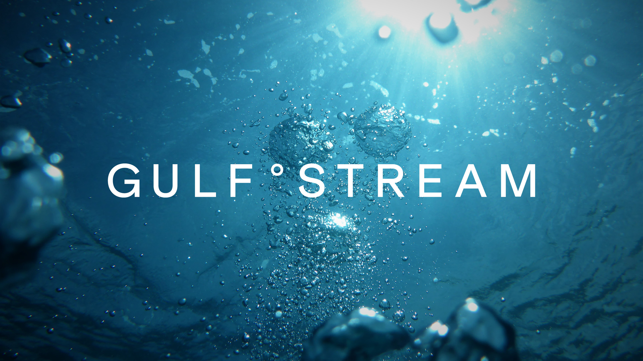
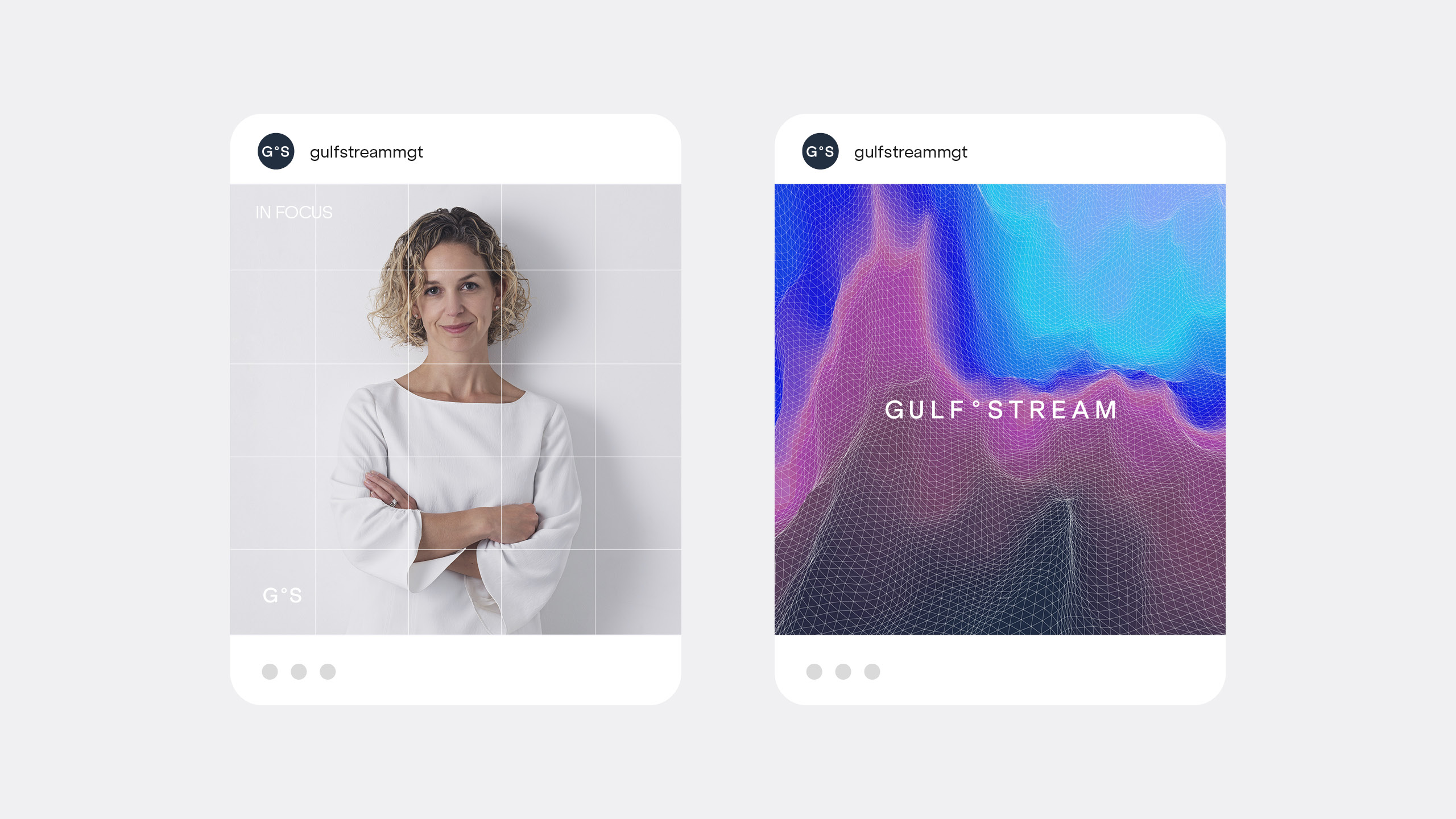


Gulf Stream Asset Management
Having evolved past its start-up roots and with a goal to reach a portfolio of $7b in managed assets, Gulf Stream were looking to evolve its branding to better communicate its stronger position in the market and the difference they provide to their clients. Looking to their name we developed a story of navigation and drew on micro and macro economics to help weave the story, going above and below the surface to convey the exceptional lengths they go to. The strategic promise 'Navigating Exceptional' became their north star and the the foundation that the new work was built on. View case study →
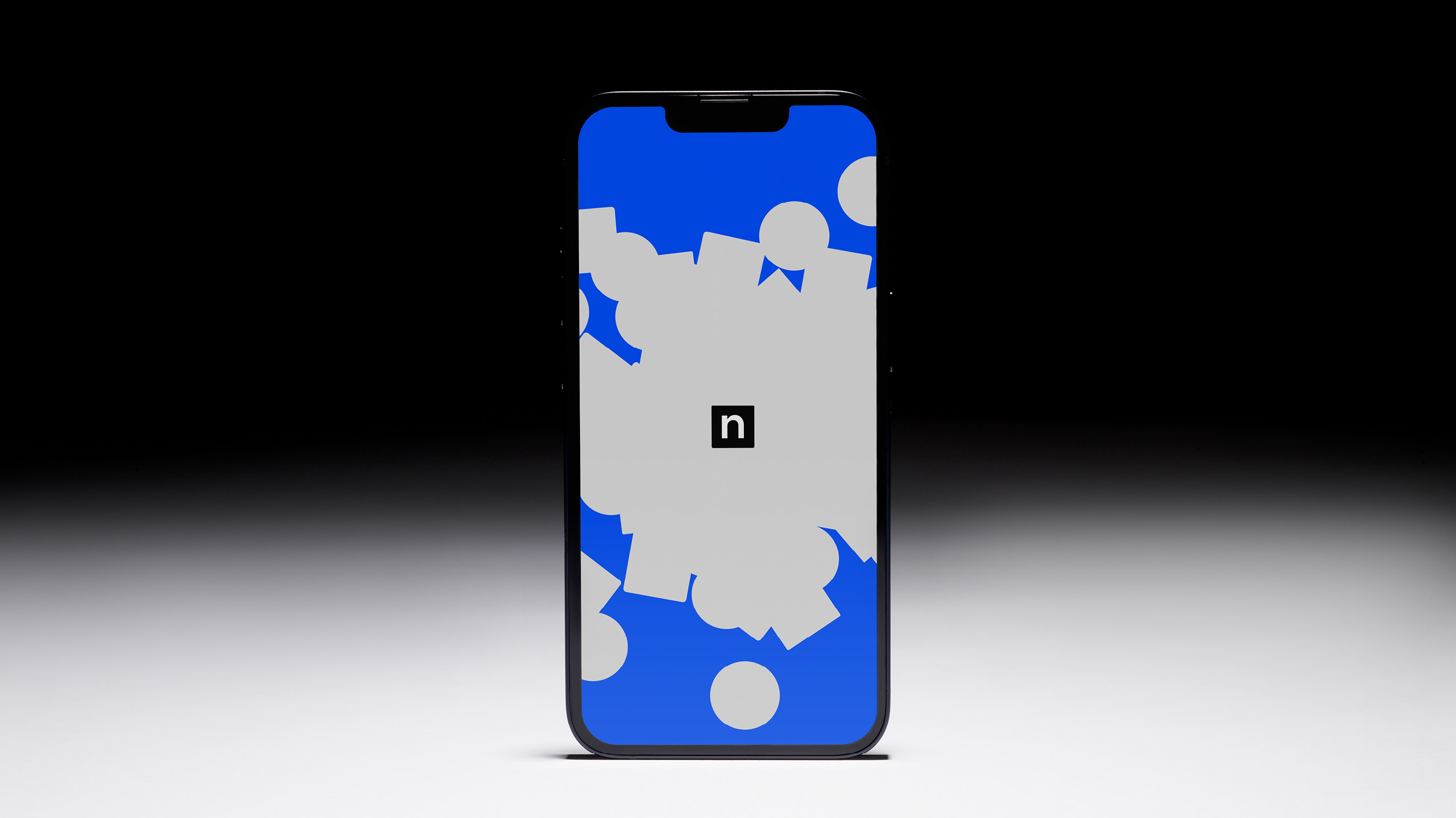

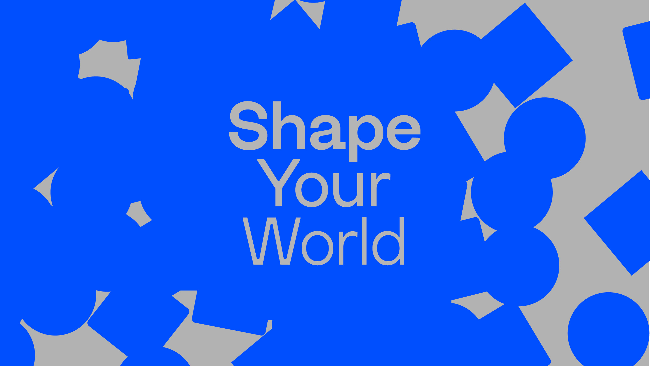
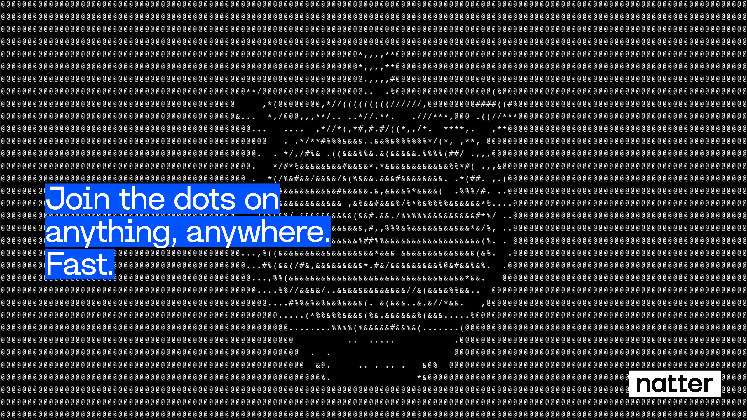
Natter
Natter was set up to give everyone a voice. A people-tech company with a product that offers a quick-fire format of one to one video chats to up to 100k people at the same time, with AI summarisation tools in-built, it offers businesses unbelievable opportunity. With so many uses we built a strategy around the idea 'Shape your world' and envisaged a visual world that references atoms and electrons, all affected by Natter, the catalyst. View case study →
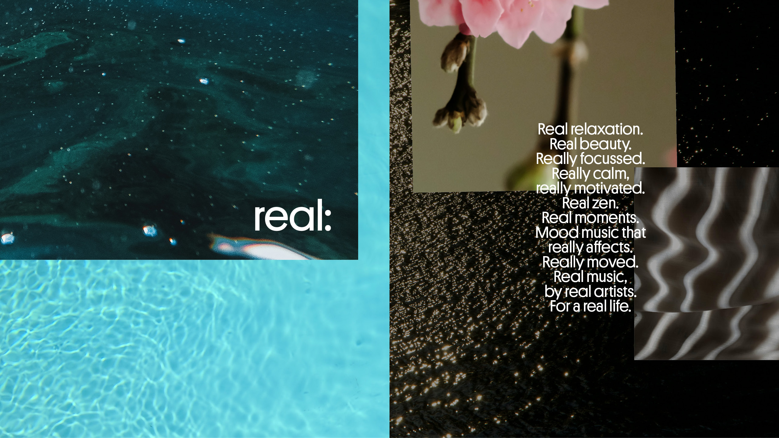


Real Music
Against a backdrop of AI-made music beginnnig to proliferate the ‘mood’ genre, Real stand for just that – real music, made by real artists. We helped them lean into their name, defining a new positioning that would resonate with their audience, offering authenticity that would help differentiate from the rise of synthetic mood music.Real music, real artists, for a real life. View case study →
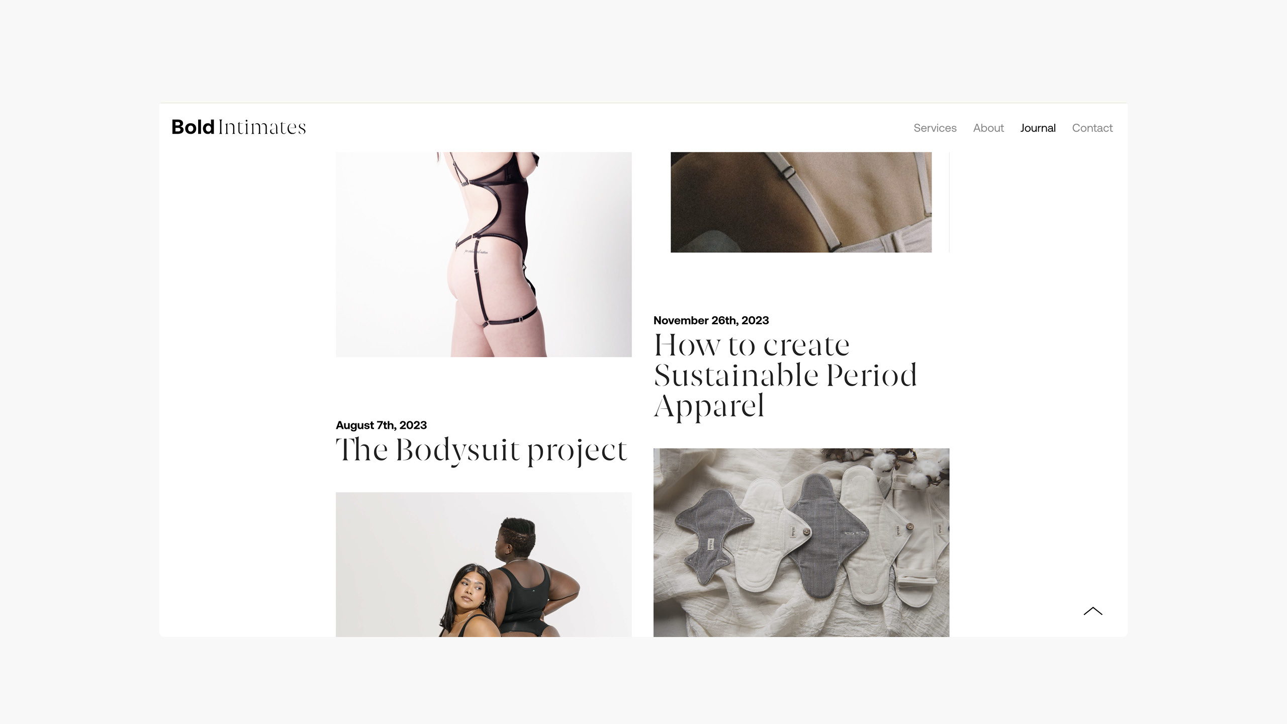
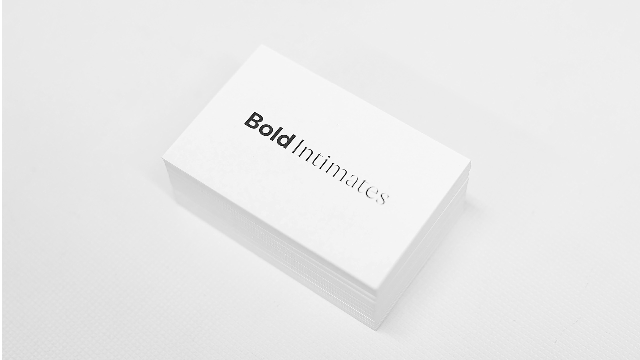
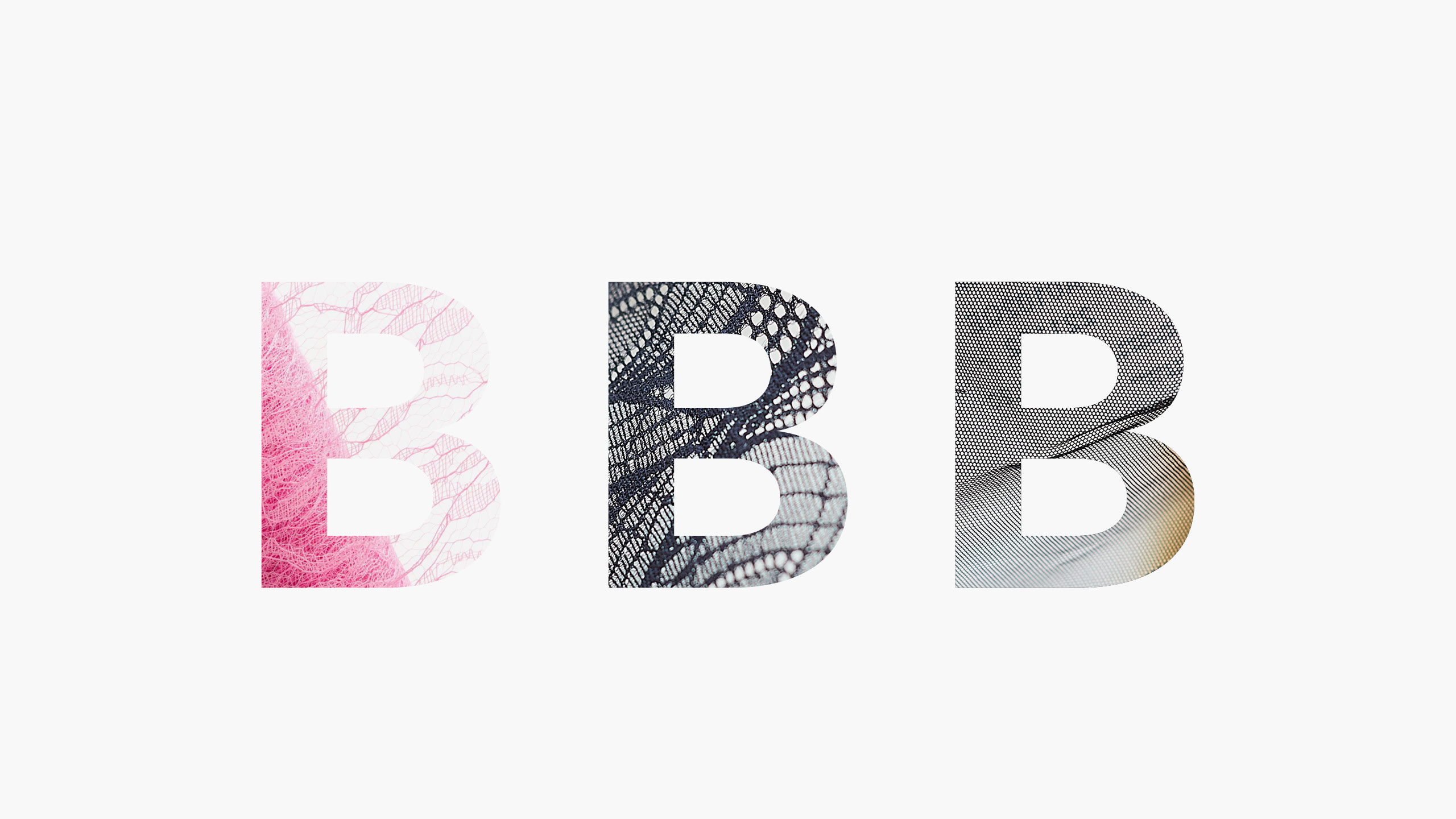
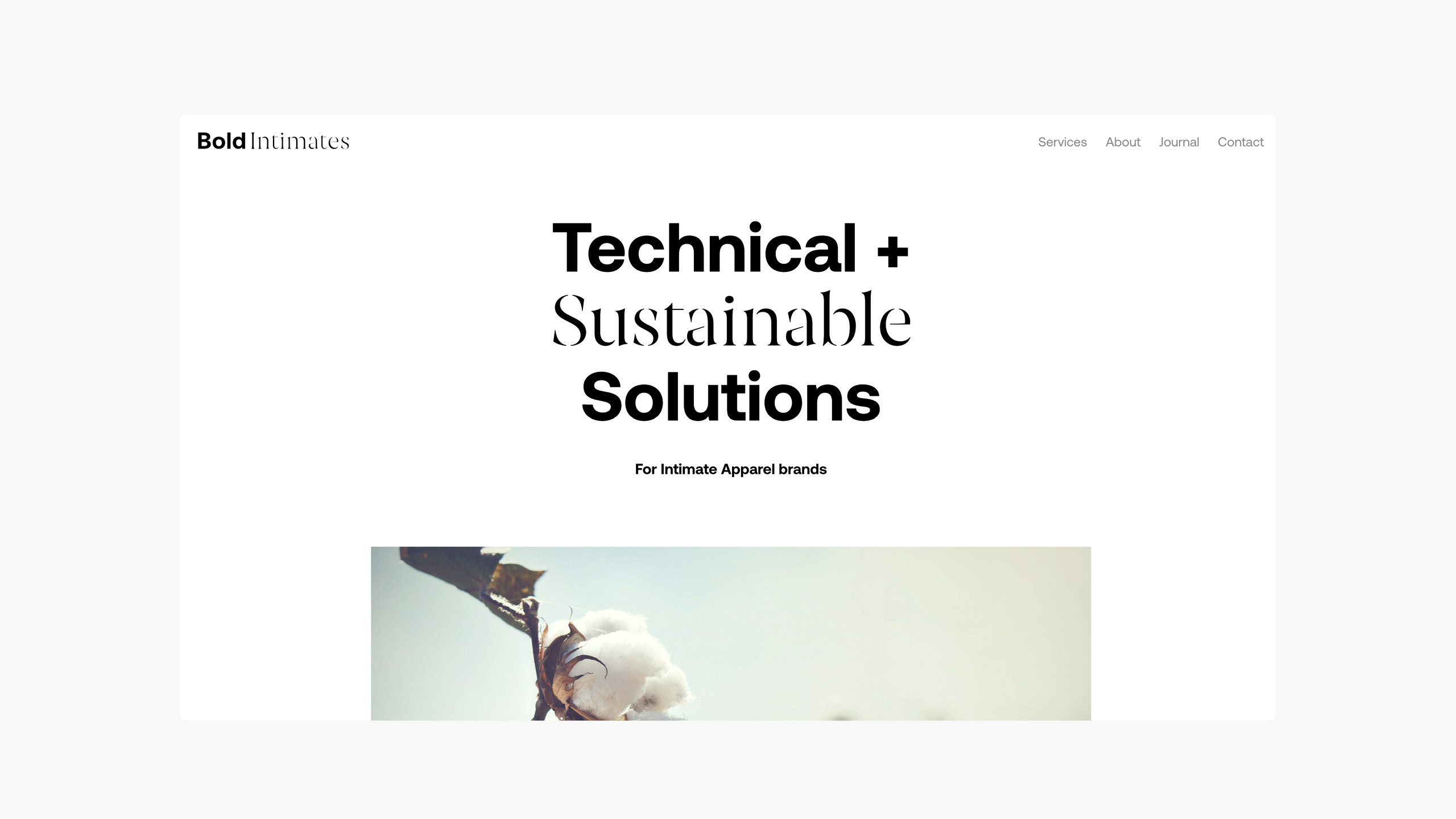
Bold Intimates
For this lingerie and swimwear consultancy, the natural world plays a key part in their beliefs - both from a responsibility aspect to a more spiritual connection from the materials we wear. Technical accuracy and innovation is at the core of their skillset and to apply that using integrity, authenticity and transparency. This was distilled down to a core idea which embraces the duality of the business, 'Precision Naturally', which carries the duality present in the name itself. The two sides of their voice became the base for a typographically led identity that embraced both a boldness alongside a more natural, softer side represented through a stencil font which subtly references the form cutters used. This created a tension that acts as a sprinboard for conversations around industry, consumer and envronment.
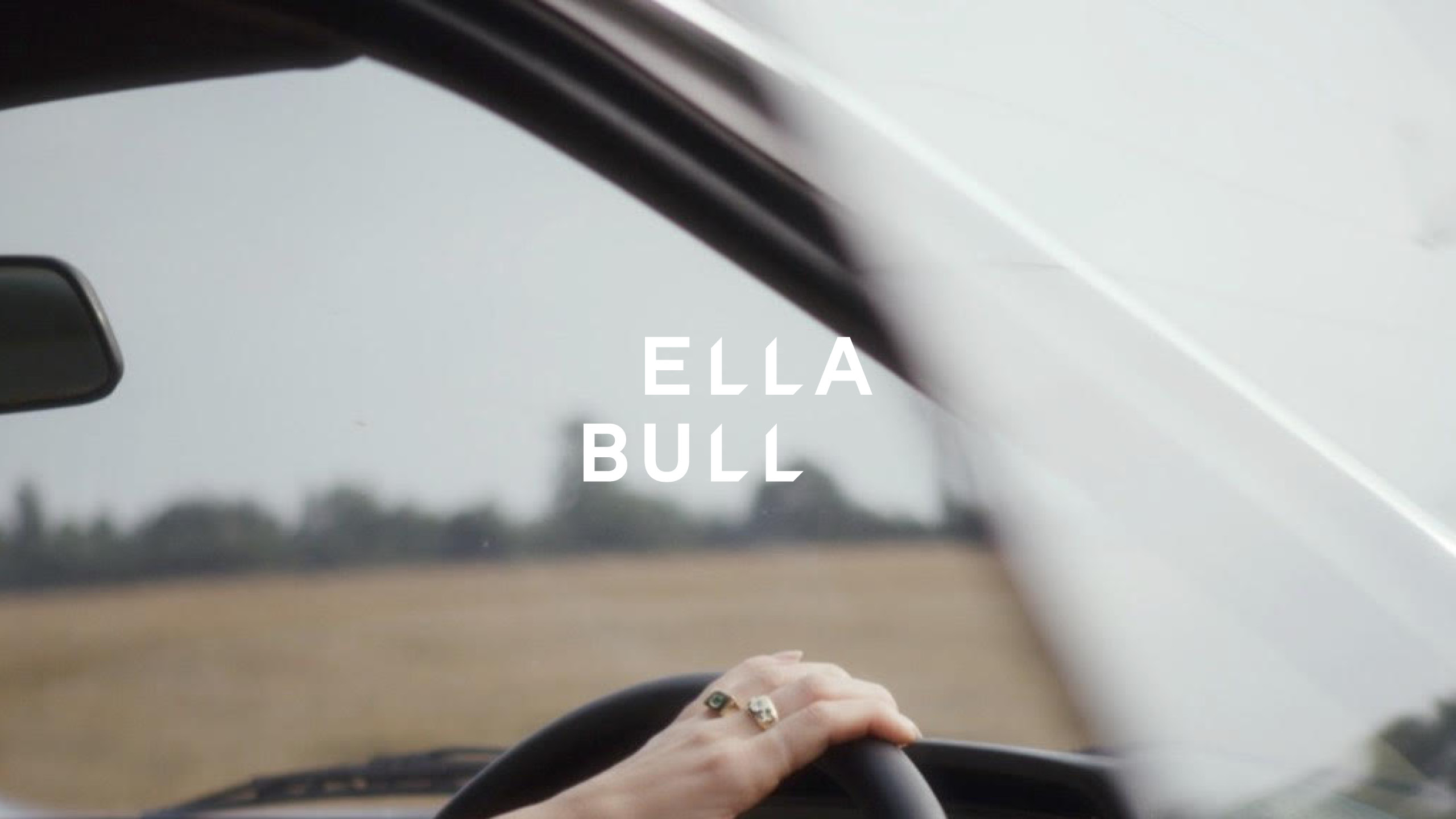
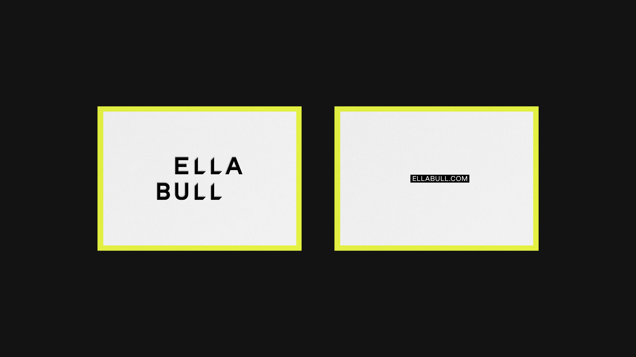
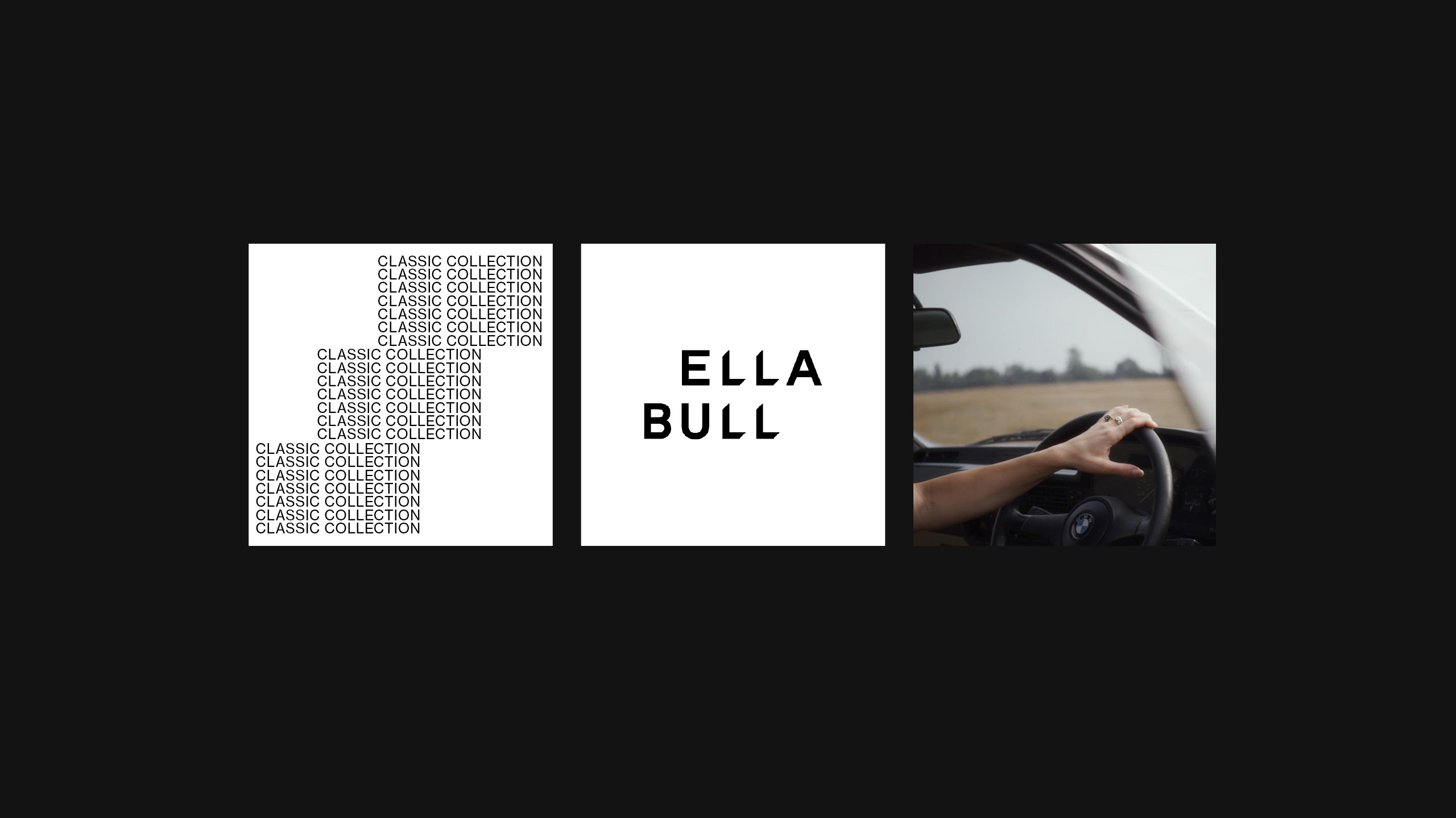
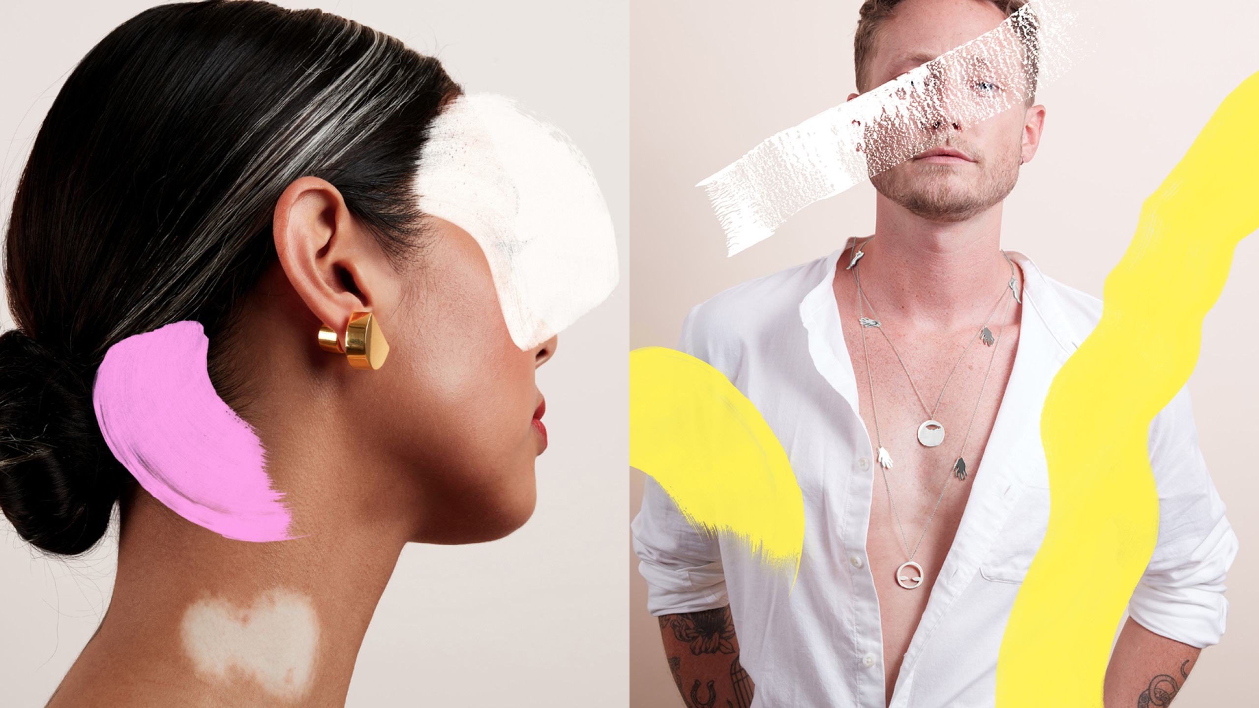
Ella Bull
Drawing on references of punk and the repetition of concrete poetry the identity is designed to sit alongside Ella’s bespoke jewellery that exists to allow people to express themselves through beautiful custom jewellery. Her work is the antithesis of glossy jewellery traditionally.

Myndstream
For the starting point of the identity we looked beyond music itself to the healing power of the sounds that lay within. We discovered the therapeutic effect of different types of sound wave, different frequencies and powerful effects they can have on mind and body. View case study →
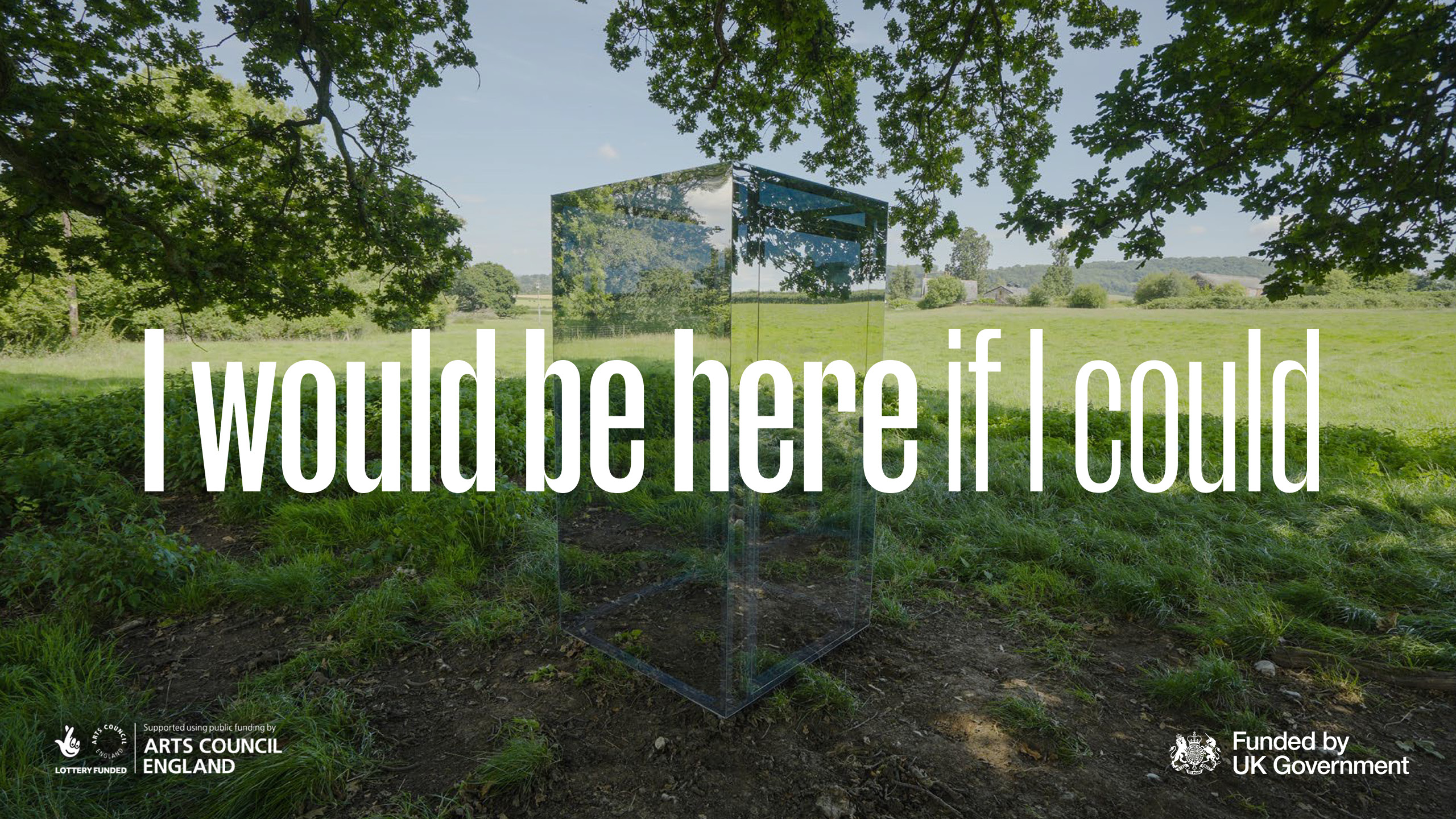
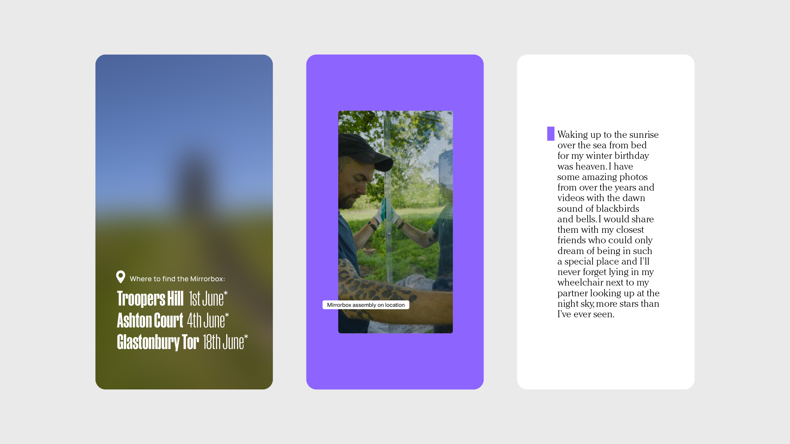
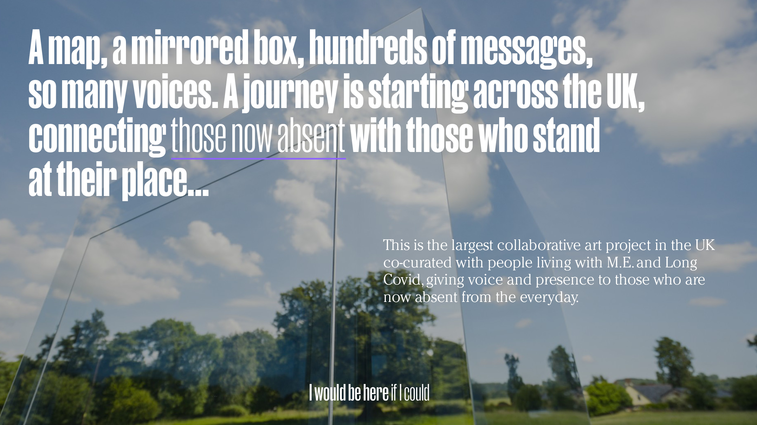
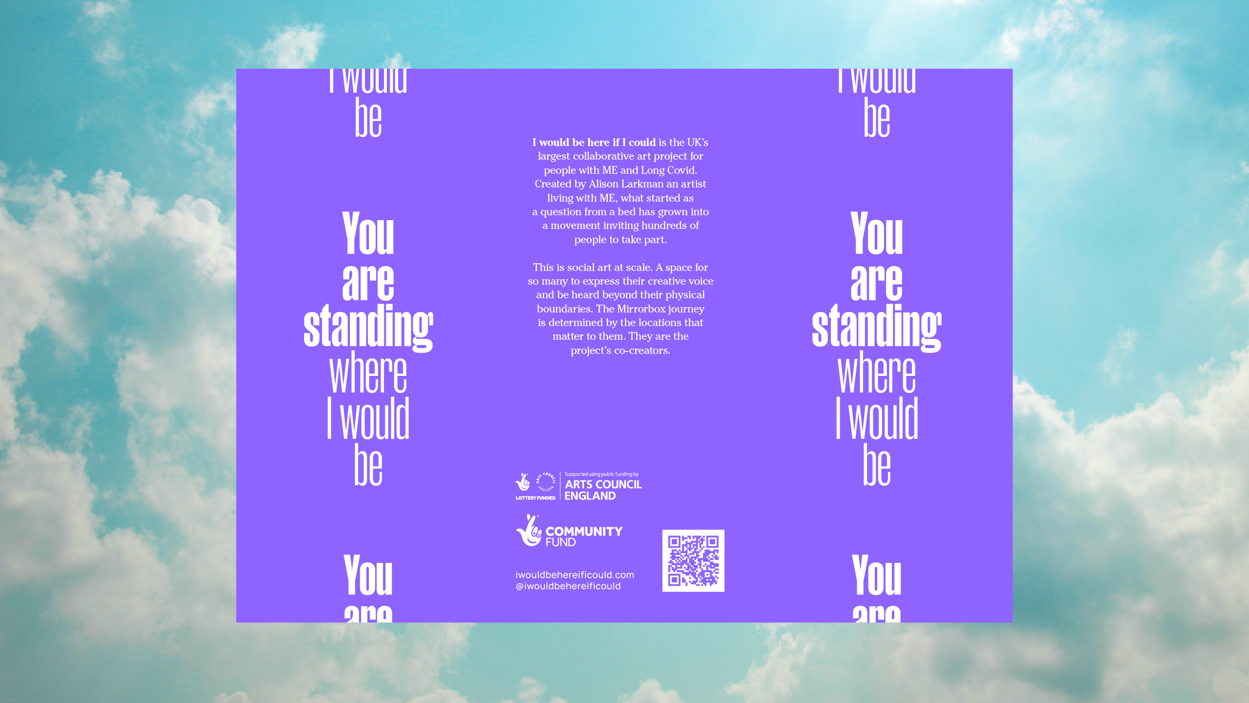
Alison Larkman
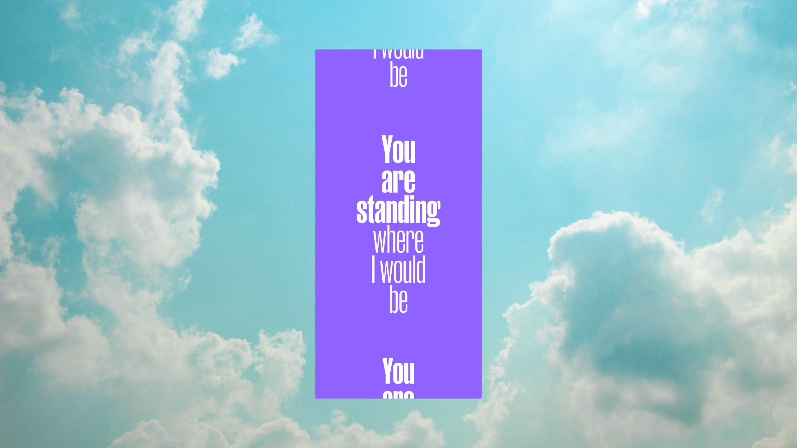
An ambitious project that exists to amplify the absence whilst aiming to reconnect them to the places they long for most. I Would Be Here If I Could is UK's largest collaborative art project and the idea of artist Alison Larkman. Over 1.5 million people are missing from society in the UK alone due to ME and long covid. Most are bed-bound and can only imagine getting back to the places they love and hold in their mind. The identity explores the concepts of time and space and aims to amplify the absence of those missing from society. Strategy bynada.co.uk. I provided creative direction and design of identity and key assets. View case study →
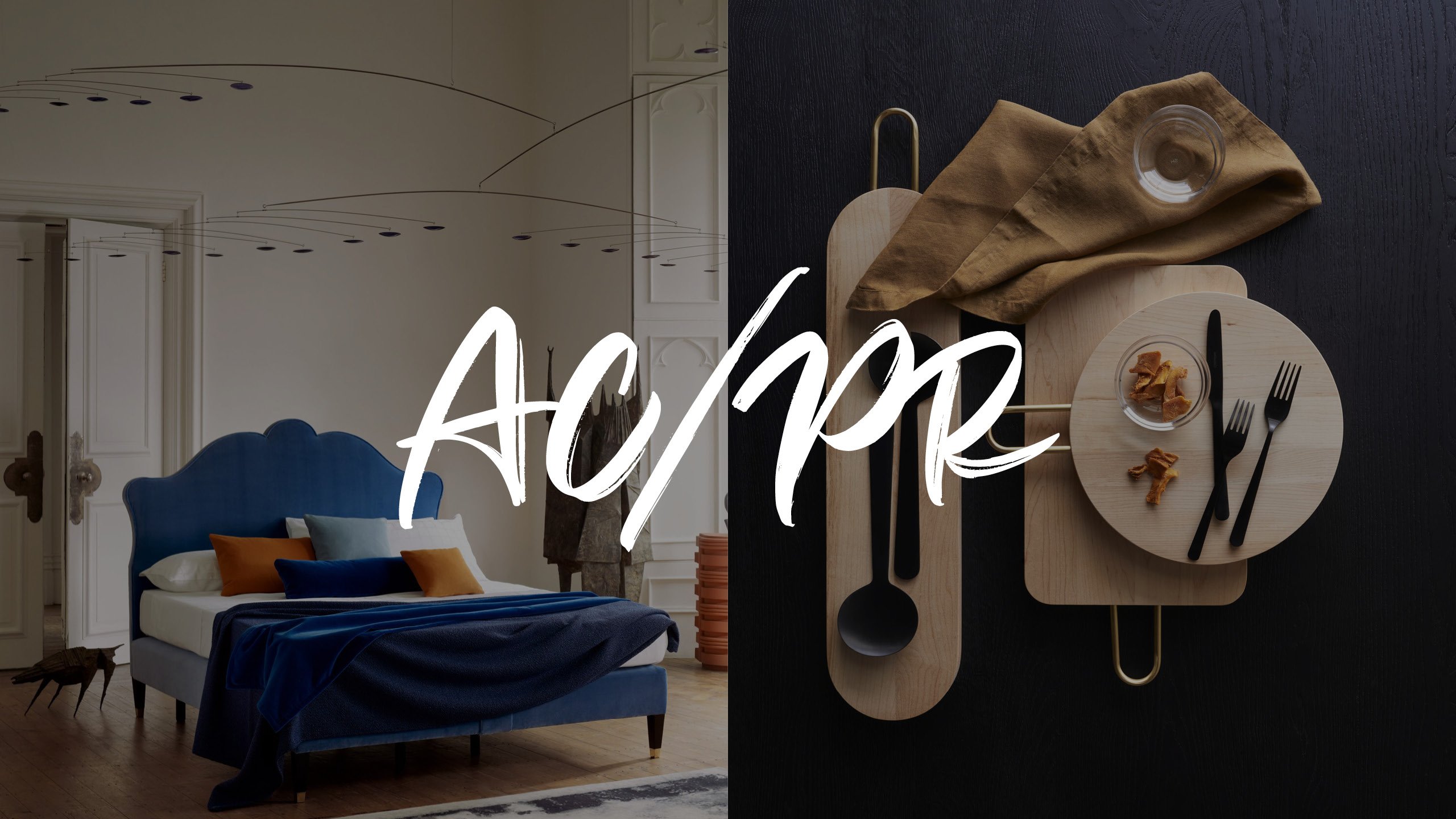
AC/PR
Strategy and identity for AC/PR – a consultancy working to amplify the work of both the designer and brand in the interiors and design space. The loose handrawn identity centres around a new purpose 'To celebrate creativity' and developed a set of guiding principles together. This helps position them towards the playful and progressive brands and designers on the roster and to the spirit that the consultancy brings. The identity is built around a hand-crated aesthetic highlighting the personal approach that is their differentiator. The palette is both joyful and sohisticated – mixing a range of neutrals with colour-pops of knocked-back acid yellow, deep pink, slate and gold. This allows enough flexibility to dial up or down dependant on the type of communication or even the type of client.


Blue Diamond Almonds
A collaboration with Sense Worldwide and Blue Diamond Almonds for RP© to position and create an identity for ALMA, their internal AI, which aims to provide valuable insight in a product that is natural resource intensive to farm. Positioned around the idea 'Almond Intelligence', ALMA aims to help point the way.
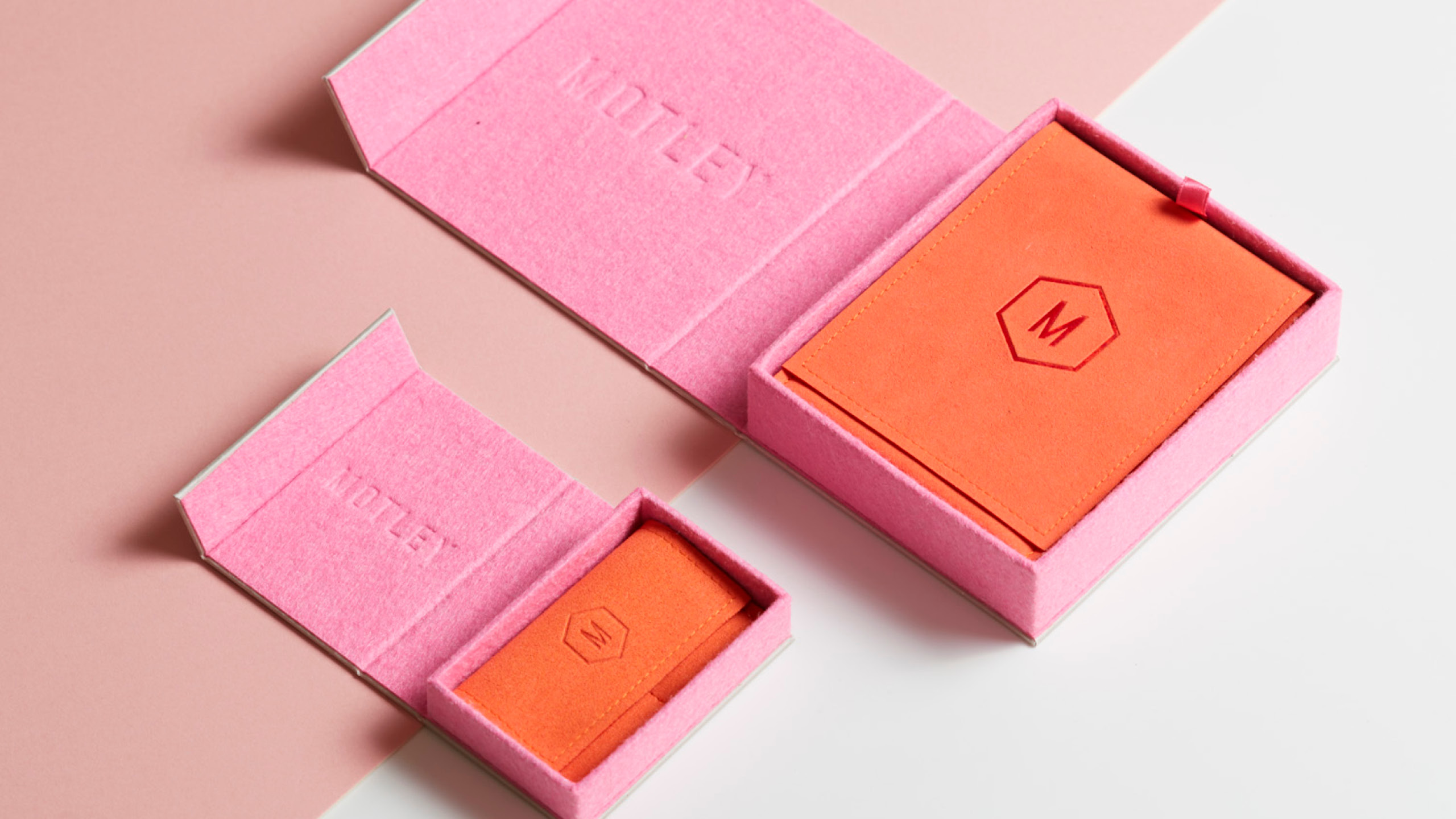
Motley London
A disruptive jewellery start-up that values creativity, quality and self-expression. Motley brings exclusive collections by the world’s best jewellers at insider prices. Being a D2C brand they are able to work directly with designers and the producers to help democratise an industry that is often seen as elite. The idea – Ownit! What might have previously been unatainable suddenly now is not. The idea is two-fold by also revealing the Motley spirit – a rallying call for self-expression and whatever you do, to always be your true self. Own it!
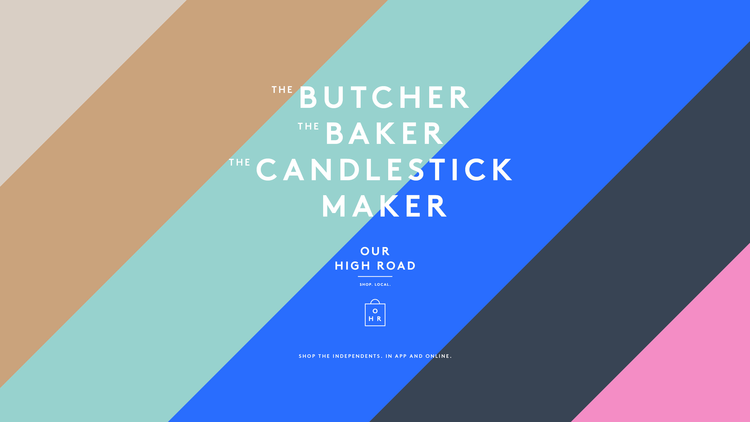
Our High Road
Defined by classic values but with a modern approach, Our High Road is a digital marketplace for local businesses. Whether you're after butcher, the baker or the candlestick maker, OHR is a transactable app that delivers to your door, placing high street independents on an equal footing to their online rivals. The visual cues of the classic high street became the inspiration but given a contemporary update. Using a combination of multi-coloured diagonal graphic stripes, with loosely-spaced typography, the identity sits between the familiar and the new. An identity toolkit and guidelines was produced for the team to use in-house.
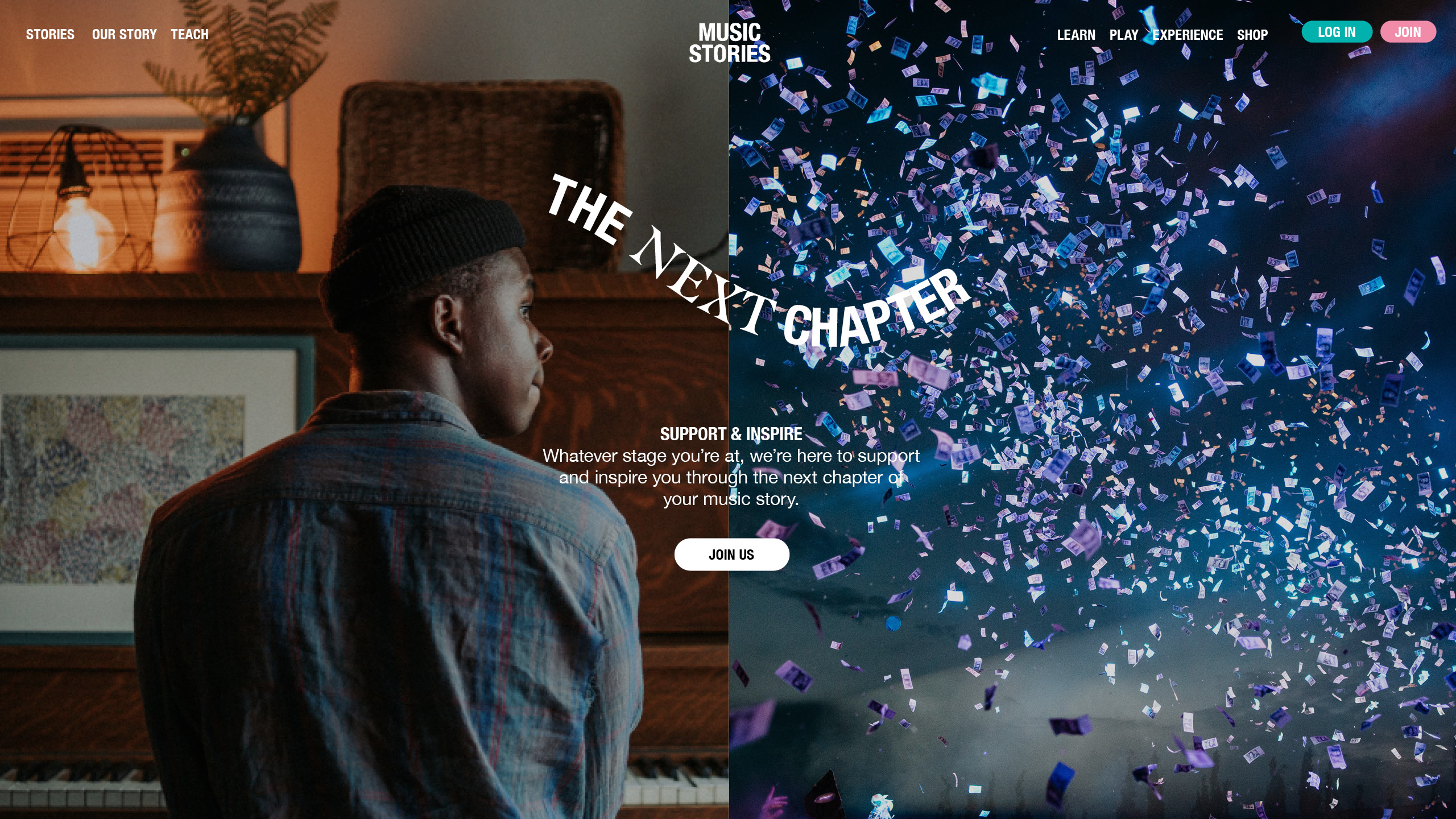
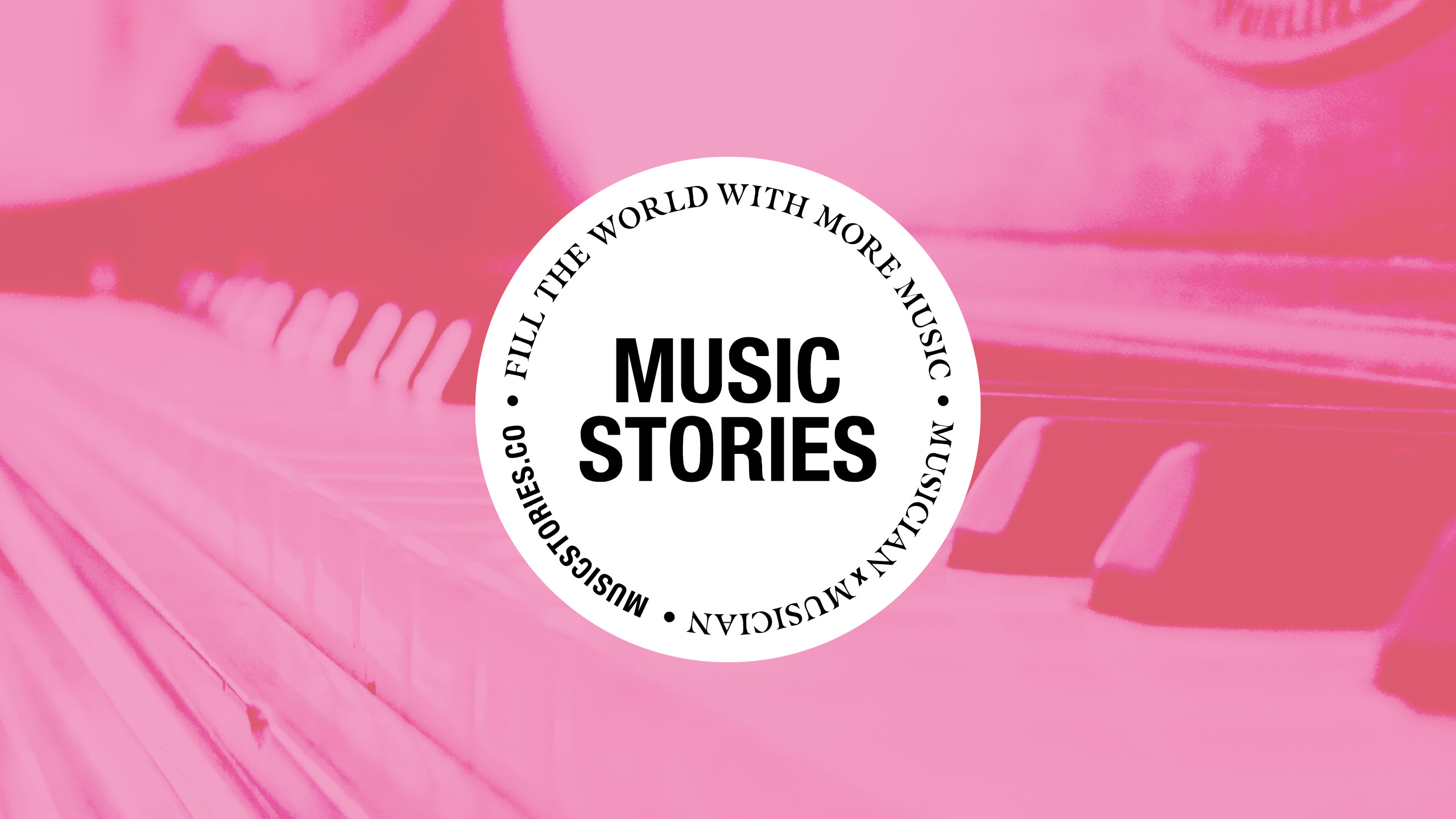
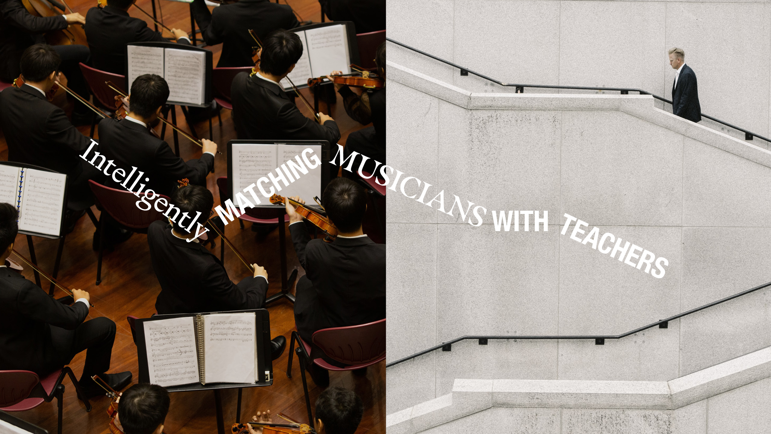
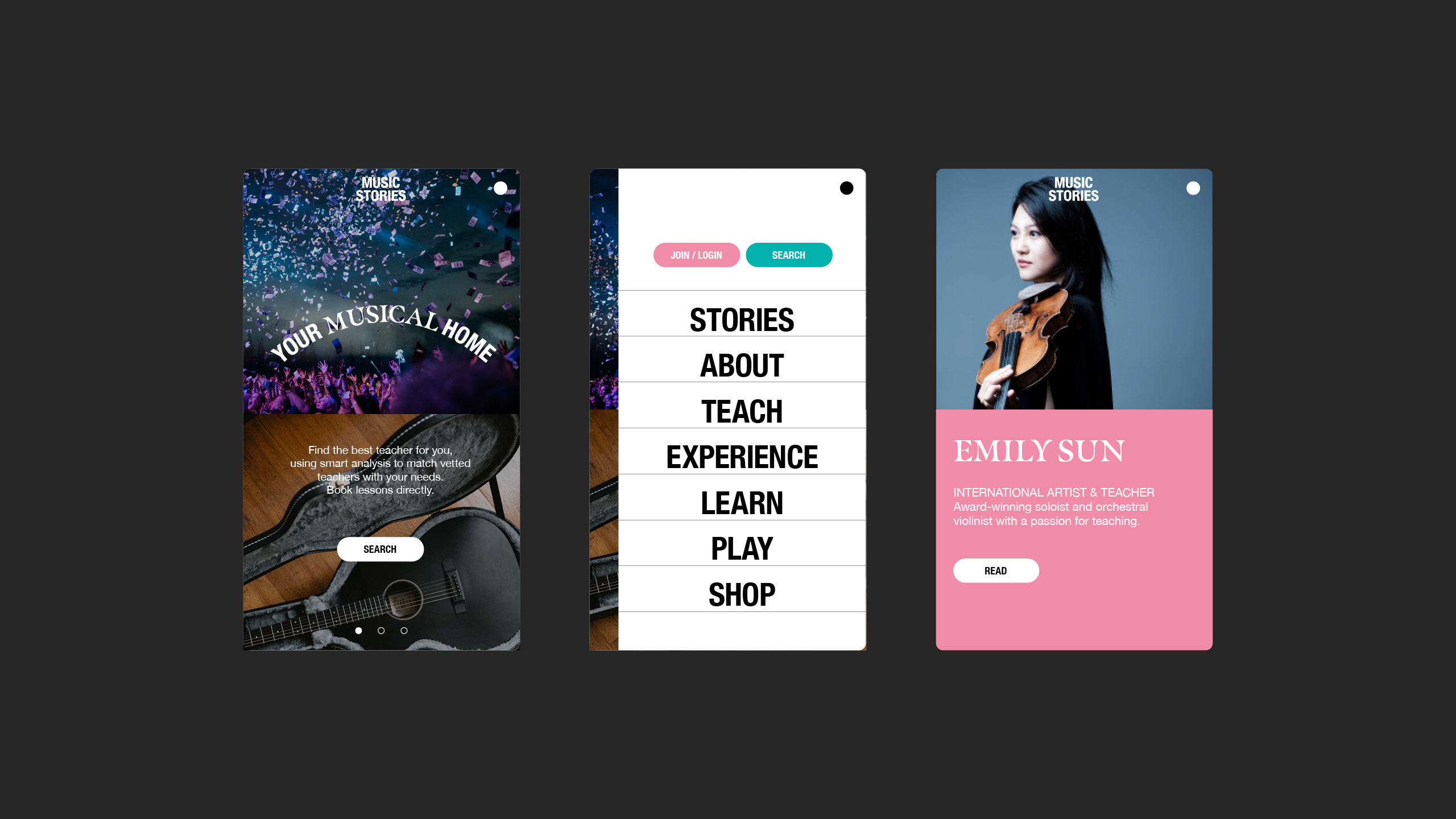
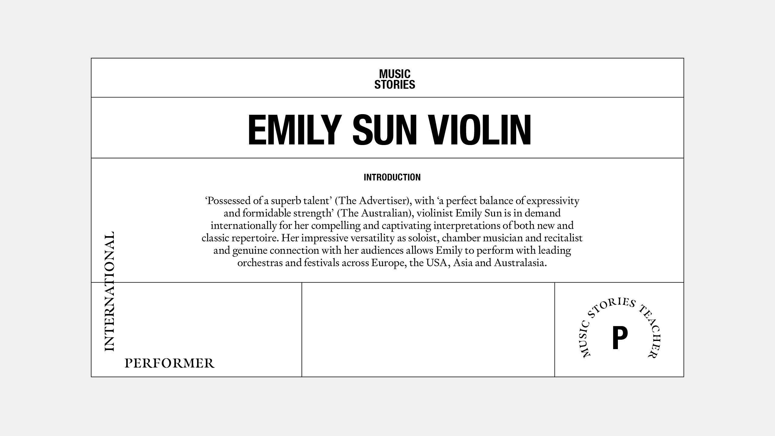
Music Stories
At its core Music Stories is a platform offering a match-making service; matching music students of all levels to tutors of all levels. We helped define a new mission to ‘fill the world with more music, musician x musician’, and an overarching idea 'The Next Chapter'. We then went about creating an identity rooted in the language of music. View case study →
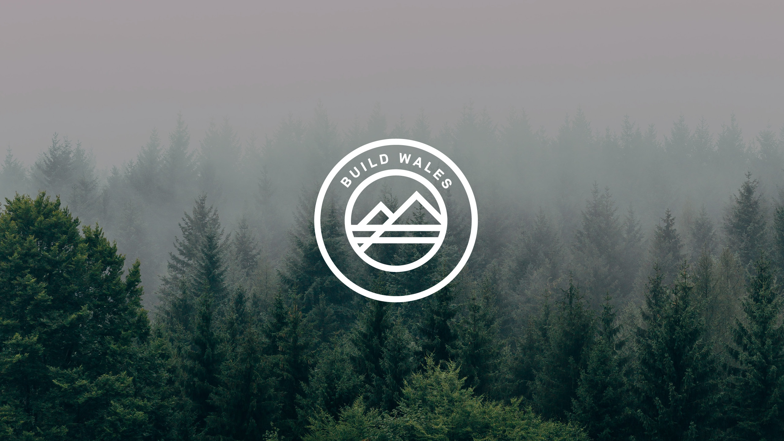
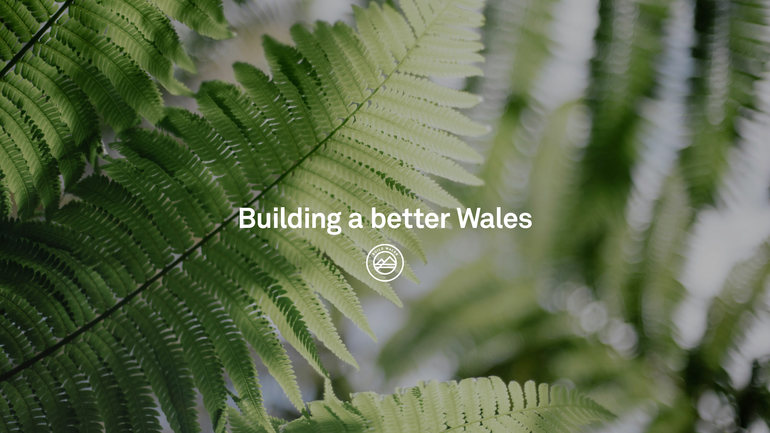
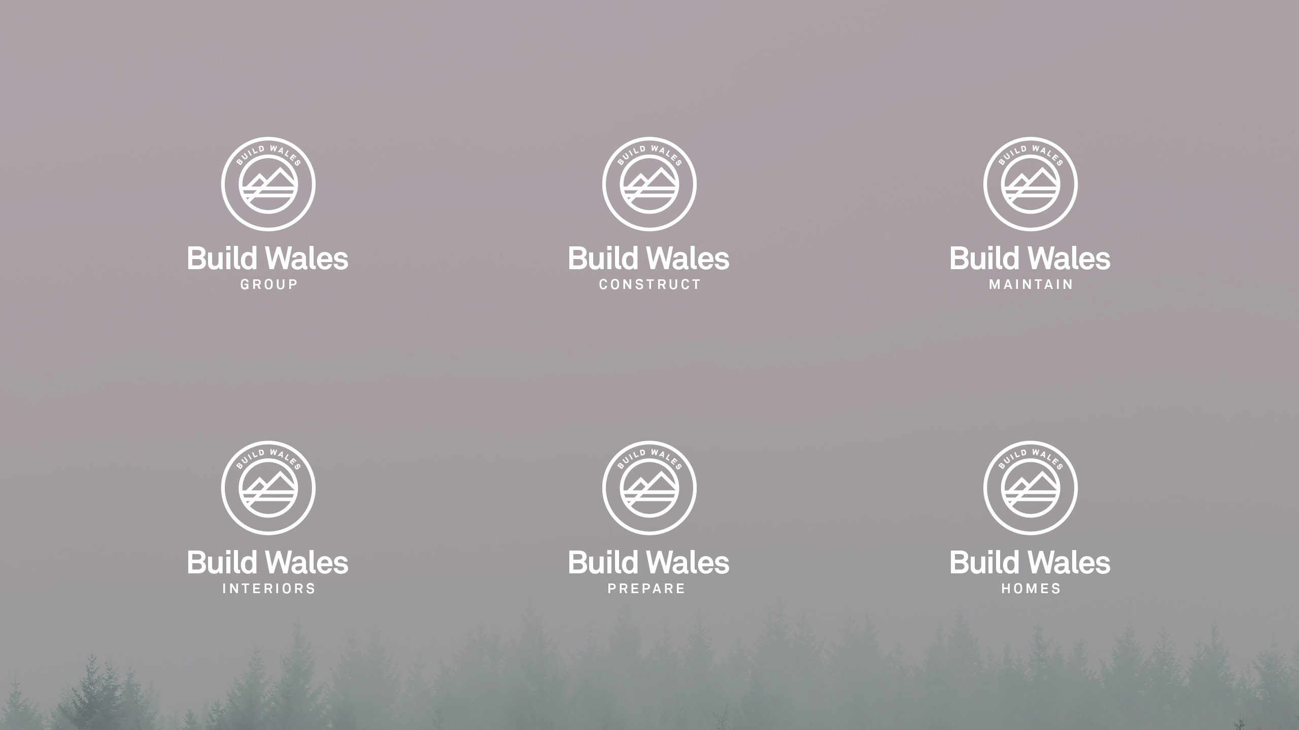

Build Wales
Brand identity for a construction company in West Wales looking to do things differently – with more integrity, more commitment and more quality. With more busineeses in the pipeline under the Build Wales brand we helped define their DNA and why they're here, to build a better Wales. With a bold vision, the identity was designed to lean in to quality, adopting a roundel style marque that draws a parallel between the regional mountains and the roofs of buildings. Mixing bold and spaced out typograhy along with a neon green they have both classic values and an innovative mindset. View case study →

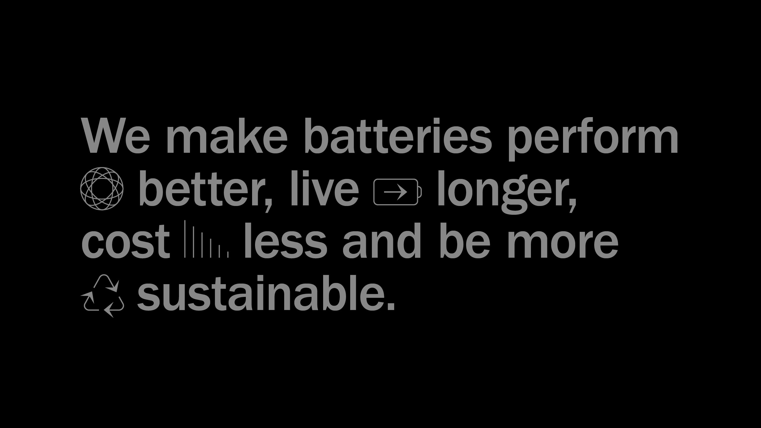
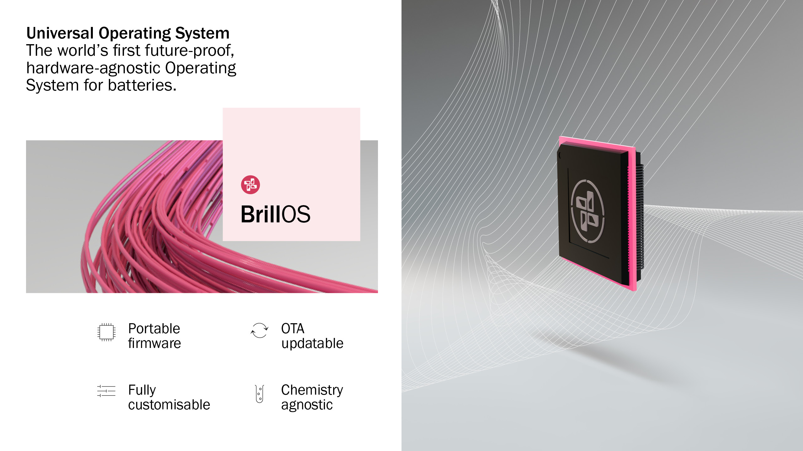
Brill Power
Brill Power identified the need for more efficient battery storage in a more electrified world. Their ground-breaking approach make batteries smarter. We built a brand platform around Battery Intelligence to clearly communicate the technology benefits. This also reinforced their links to academia and Oxford University from where the company was born, and leverages their continued links in the continued supply of new talent for growth. View case study →
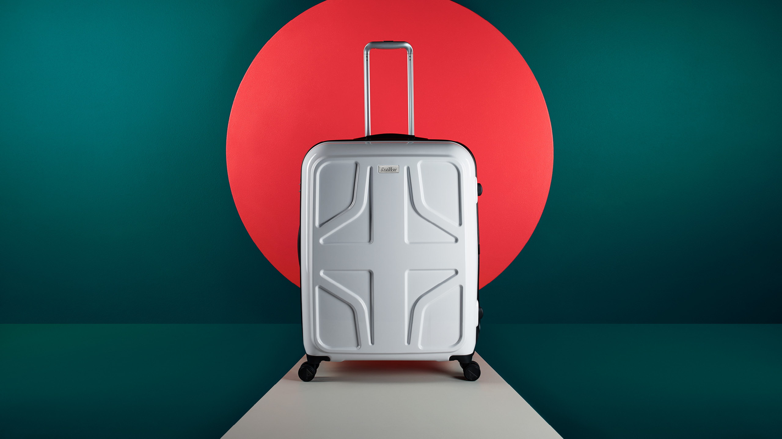
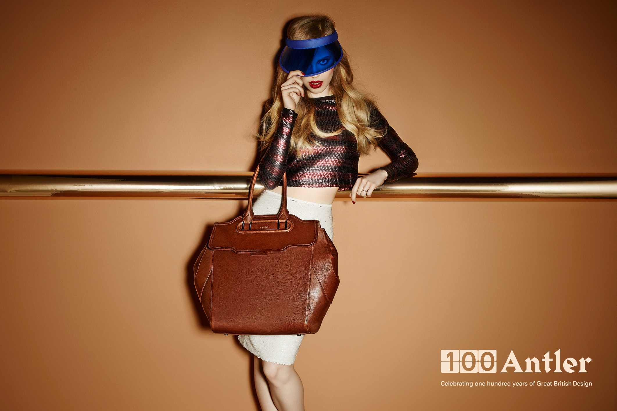
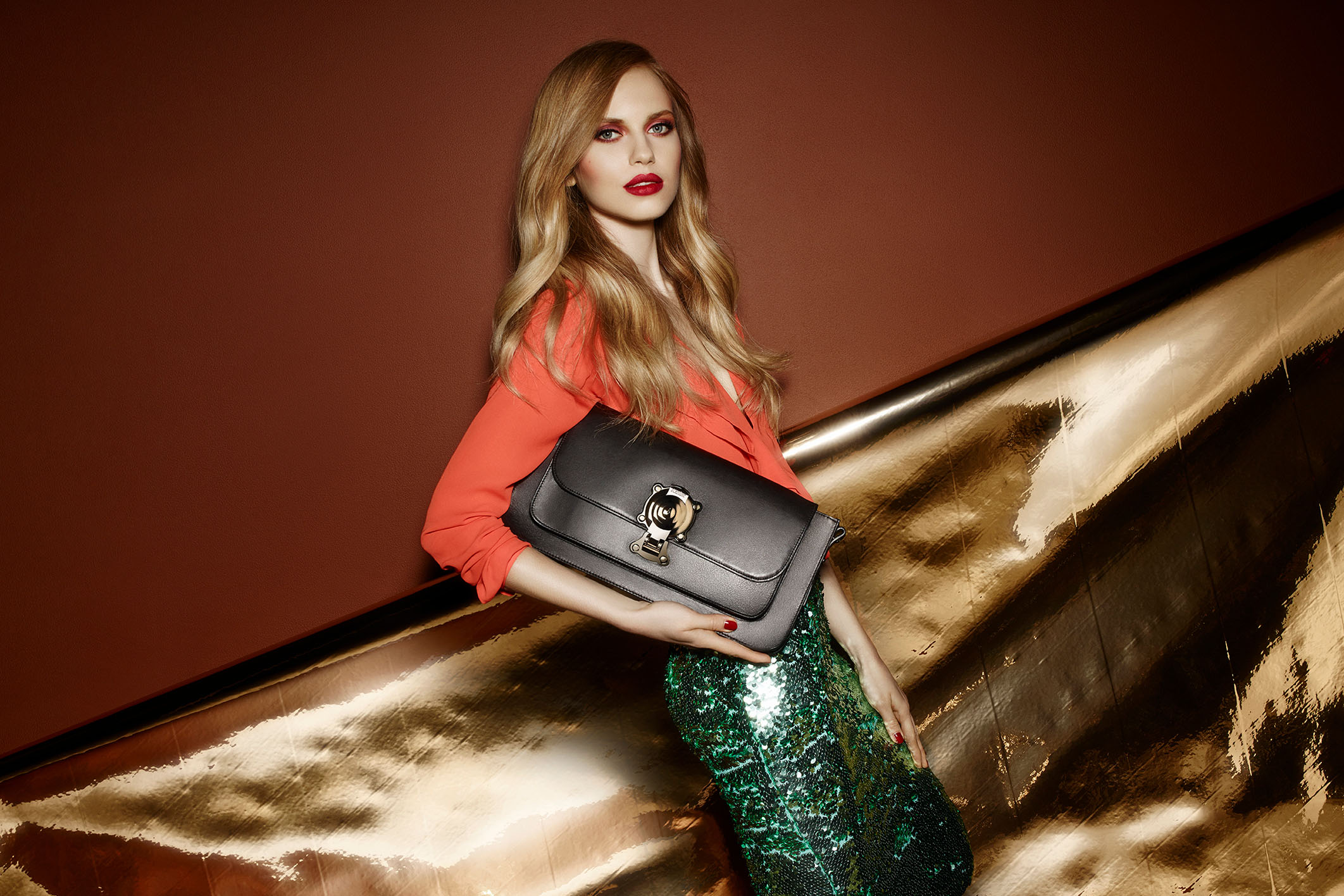
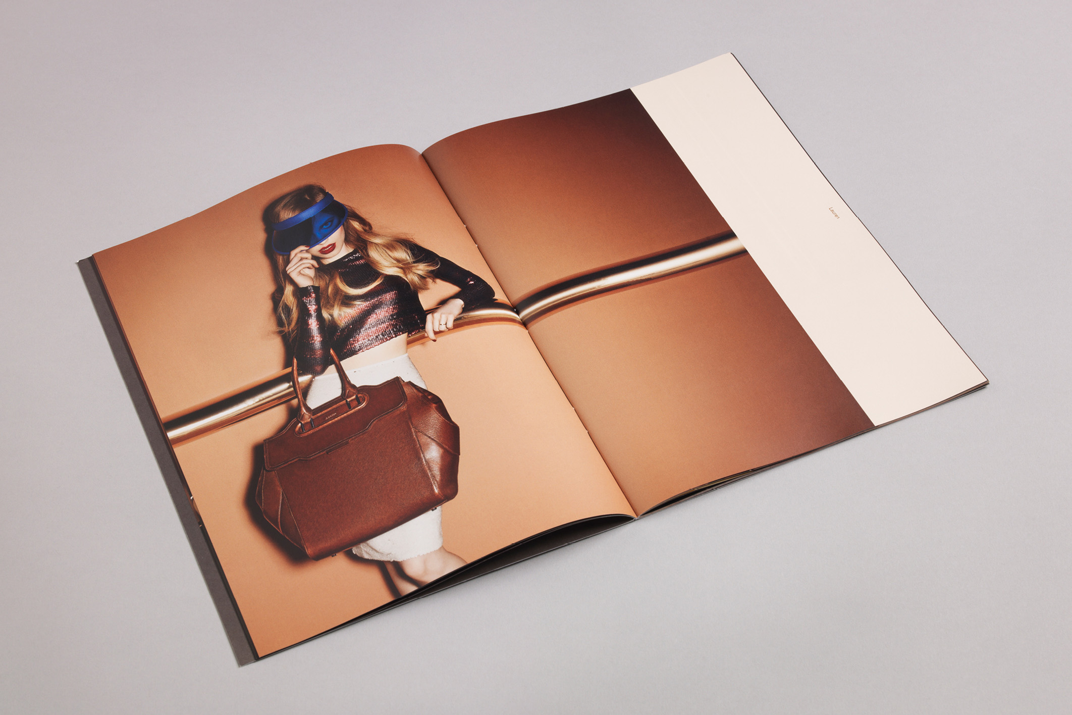
Antler
An opportunity to reposition the Antler business as a challenger brand that embraces change and exudes confidence. The new brand identity is built on the culture and flair of British design and underpinned by heritage, history and craft. This fresh, bold identity marries a fun and playful tone of voice with sophisticated imagery by acclaimed photographer Matthew Shave. To bring the playful personality to life, we took a reductive approach when art directing the photography. Using bold colour and simple shapes with a combination of still life mixed with fashion photography to give it some energy and to bring it to life. Strategy by The Cernis Collective. Agency ©Mammal Design.

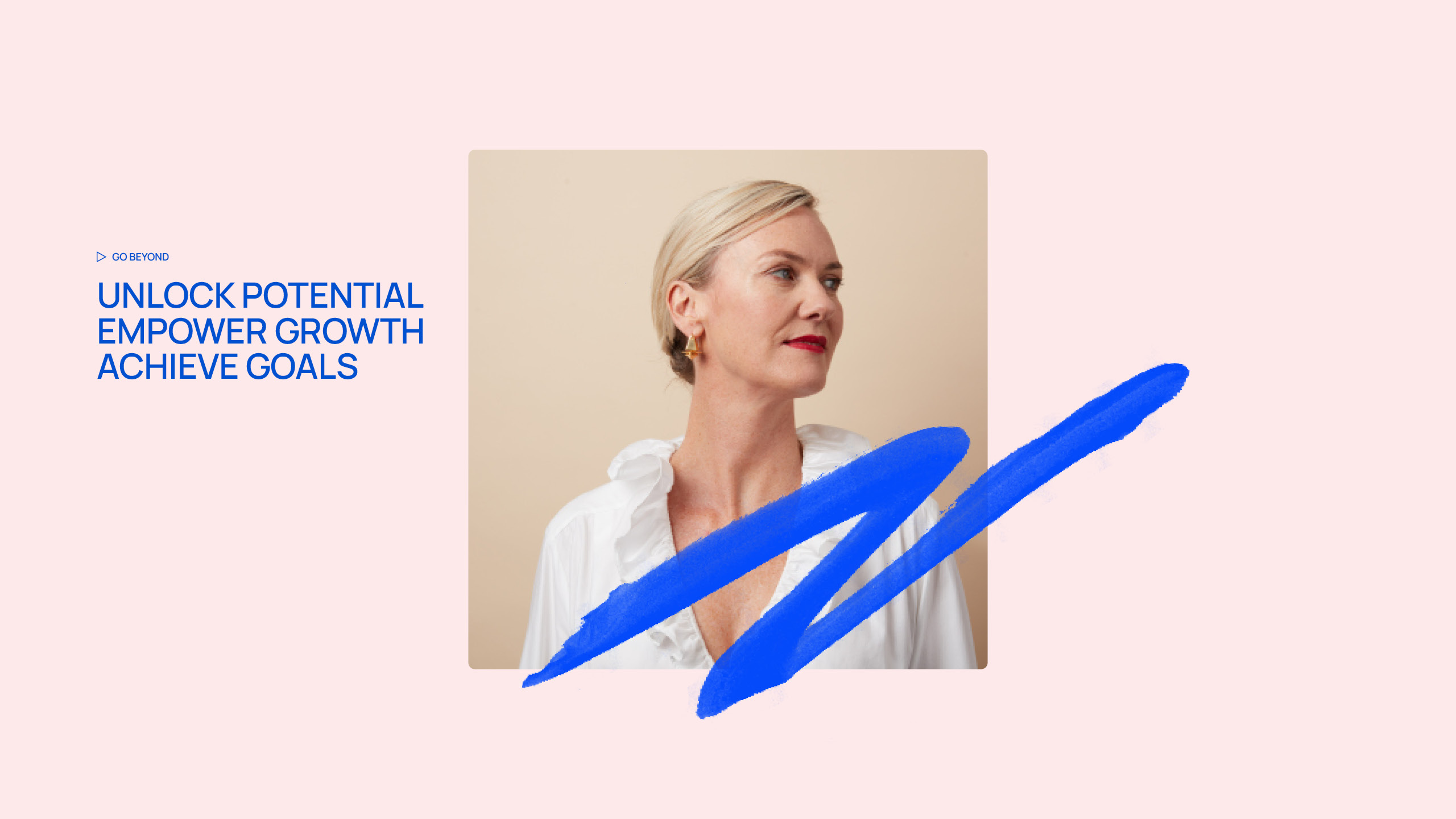
My Delta
Strategy and identity for a coaching consultancy. Working with teens to CEO's, My Delta is on a mission to empower the leaders of tomorrow and today to reach further. Along with a new promise 'Go Beyond', an idea that ran through the visual and verbal identity. The logo incorporates the triangular symbol for Delta (which means change), becoming a positive directional mark.
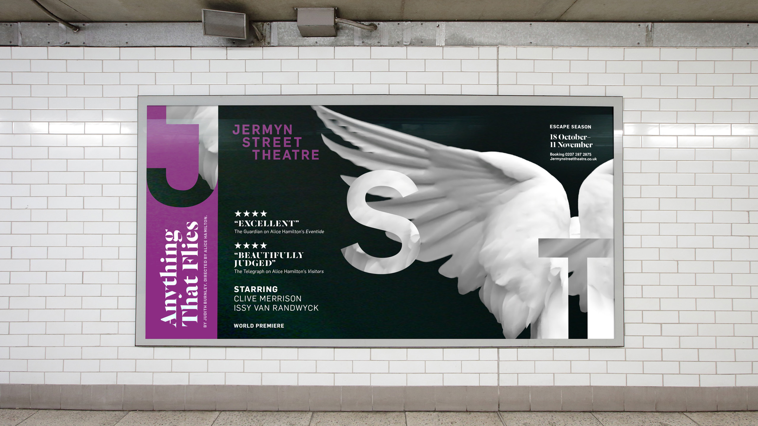


Jermyn Street Theatre
A new positioning idea ‘Closer to Drama’ enabled them to clearly communicate the benefit of a more visceral experience as well as the work they do in supporting the next generation of directors and producers. Using this, we developed a stepped custom wordmark, designed to build a sense of drama - leading the audience down to the stage in the theatre below. In purple we found a colour that they could own. in s crowded theatre space. The oversized JST characters that step diagonally anchor to the edges of the page. The confined usage references the sense of intimacy audiences experience. Cropping sections of the image into the characters created a sense of drama while acting as a watermark to reflect ownership of each production. View case study →
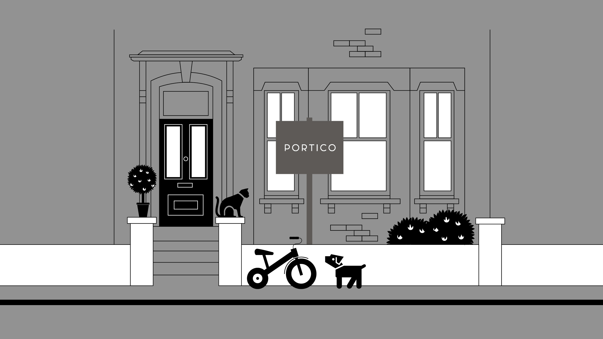
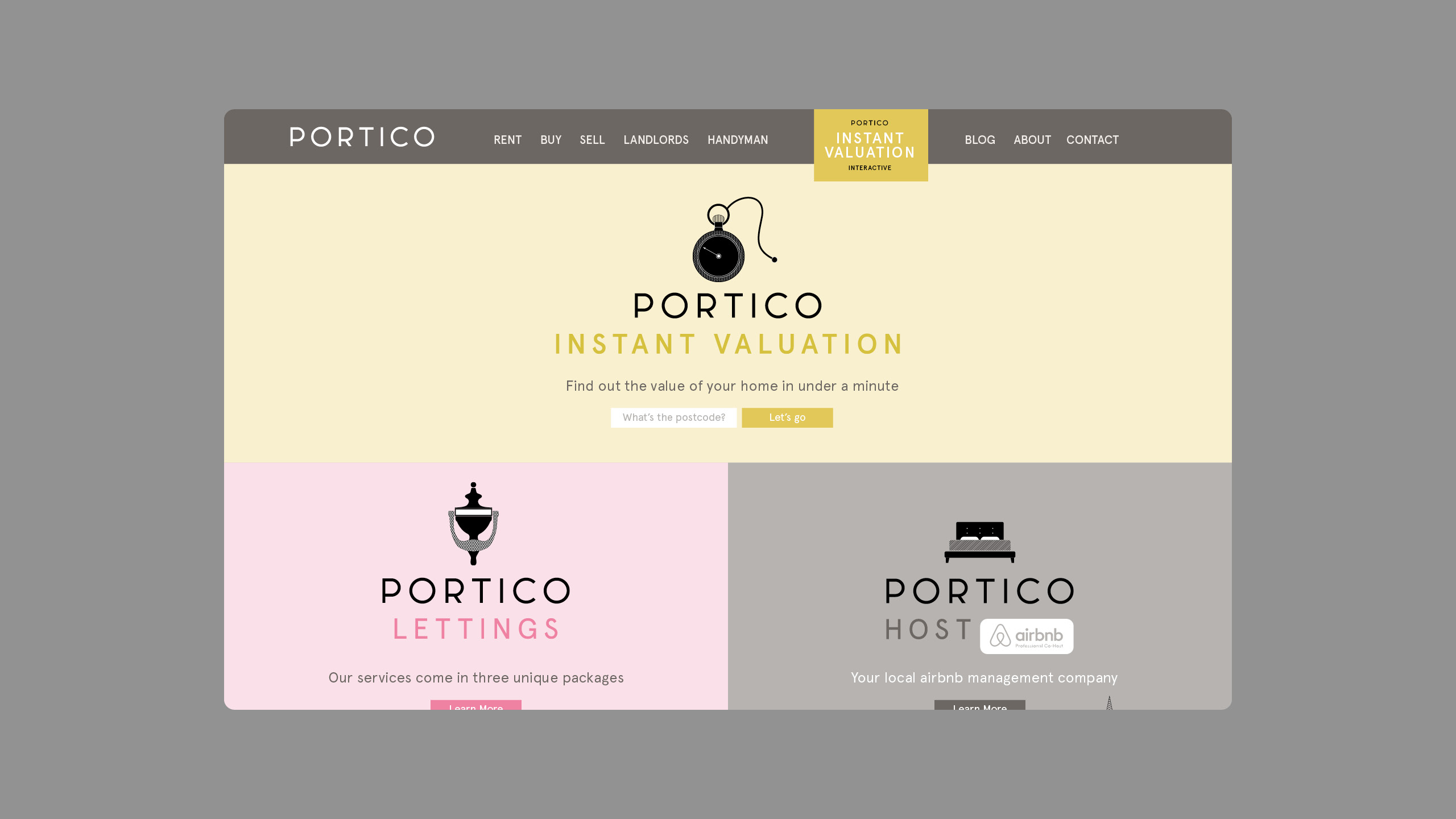
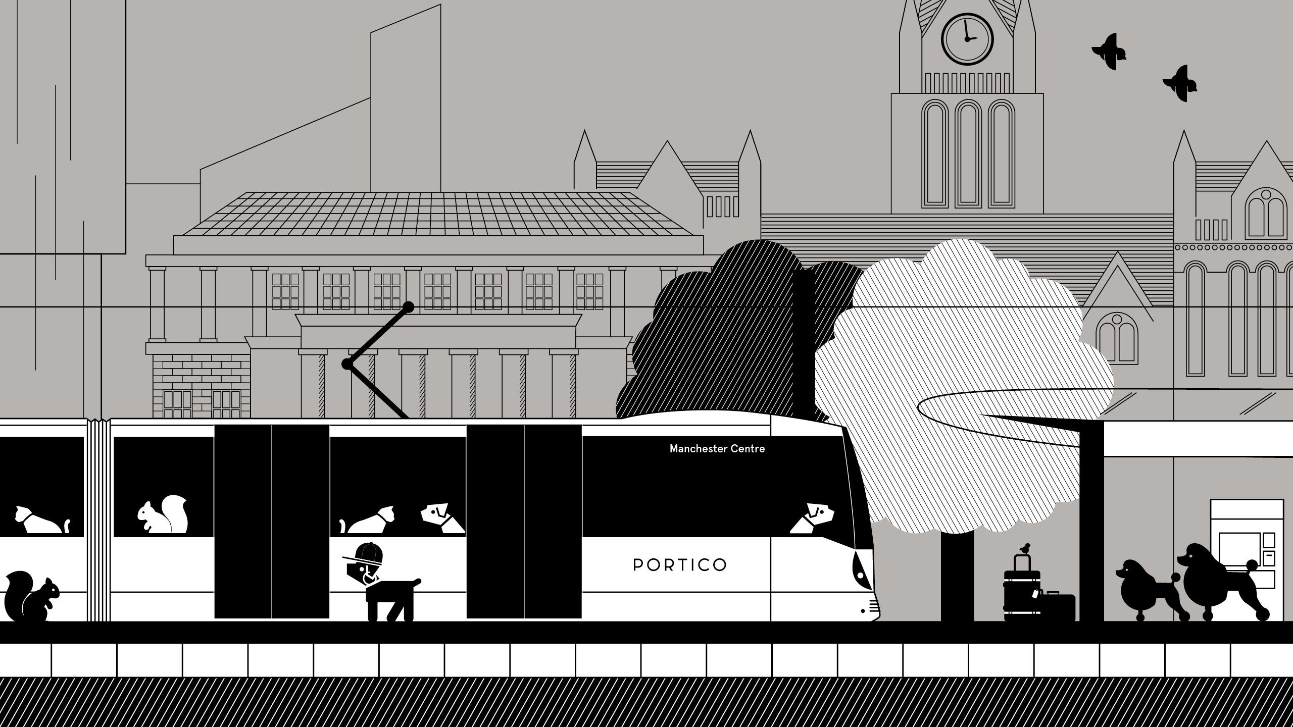
Portico
Portico is a different kind of estate agency, one that is more useful than most. With a proposition unlike anything else in the market they needed an identity to match. Working with the existing logo and colour palette we created a versatile illustrated world full of character that could flex to the range of locations. A series of operational area illustrations distilled the character as well as the landmarks of a place.
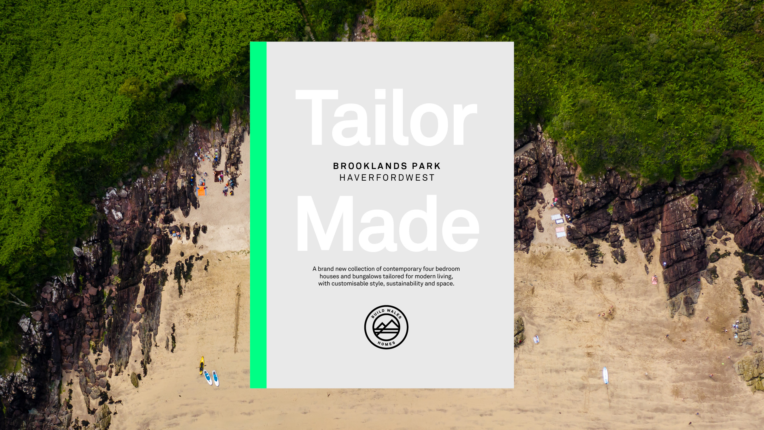
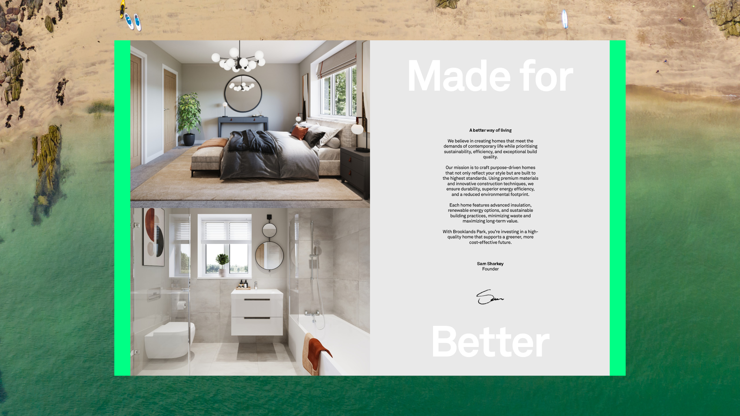
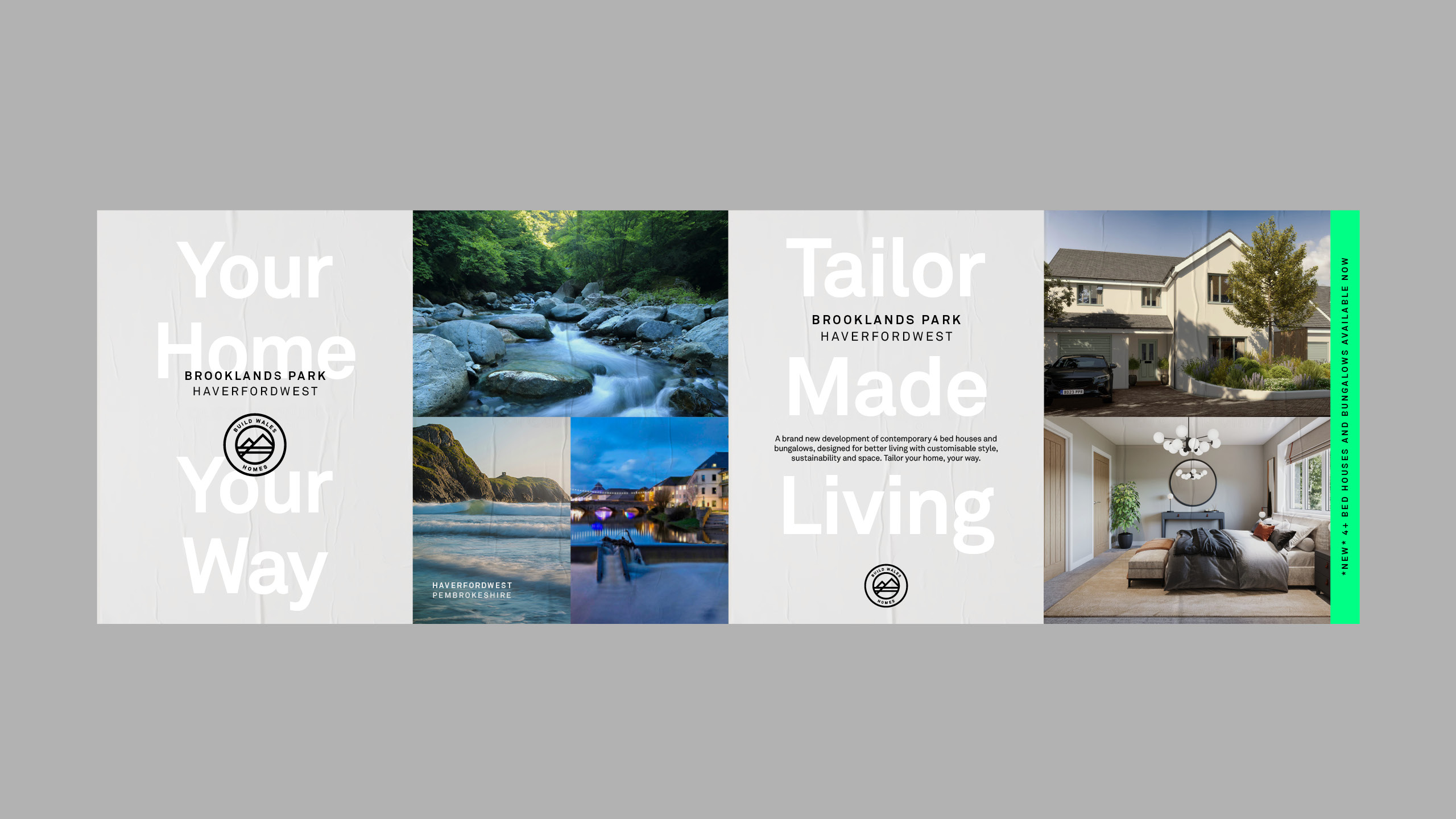
Build Wales Homes
The first Build Wales development, set in a coastal town of Pembrokeshire looked to new approaches in materials and personalisation allowing greater control and less waste. We defined a proposition aroud this idea that also pays homage to the abundance of lifestyle opportunities that the location offers. View case study →
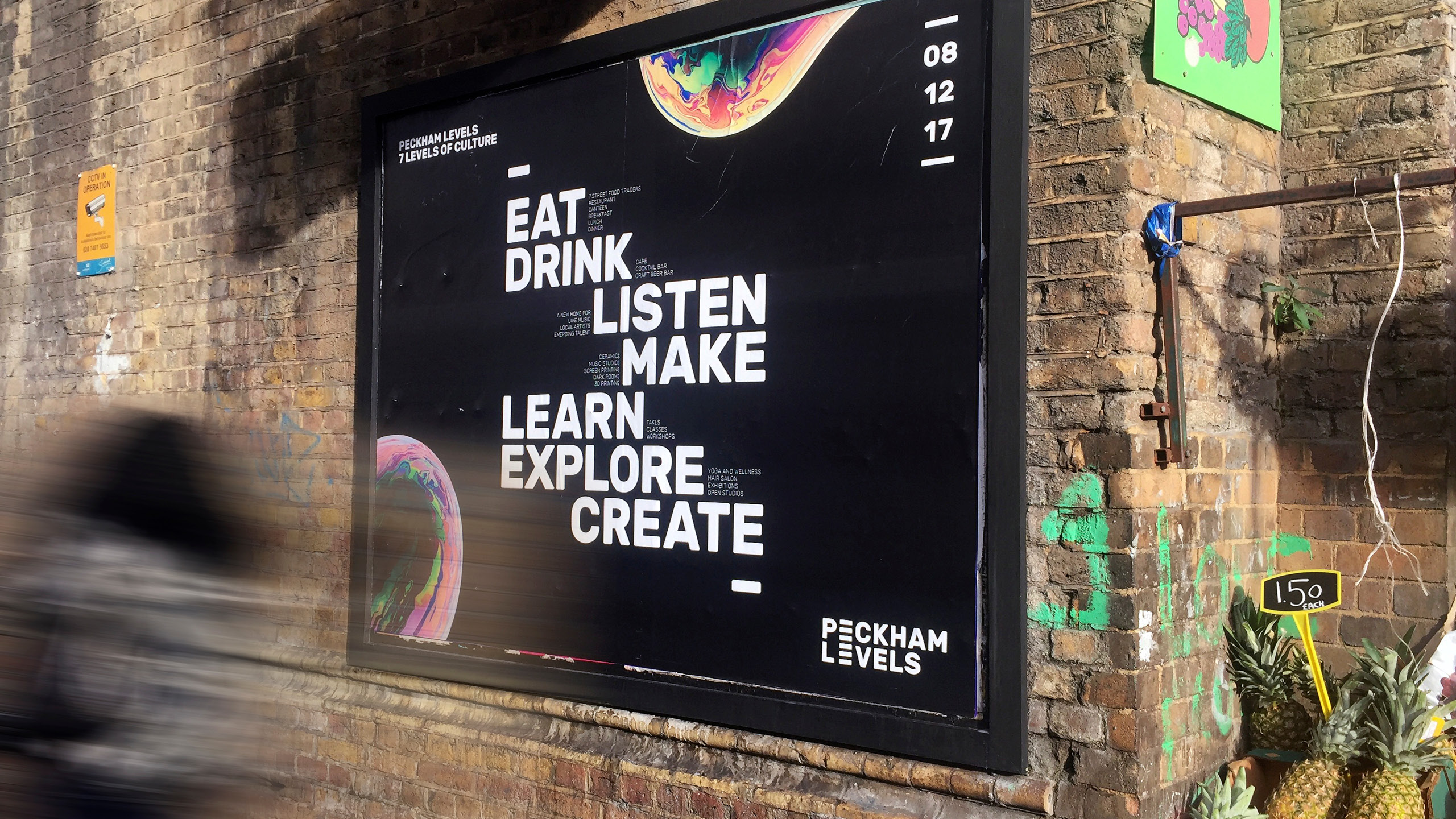
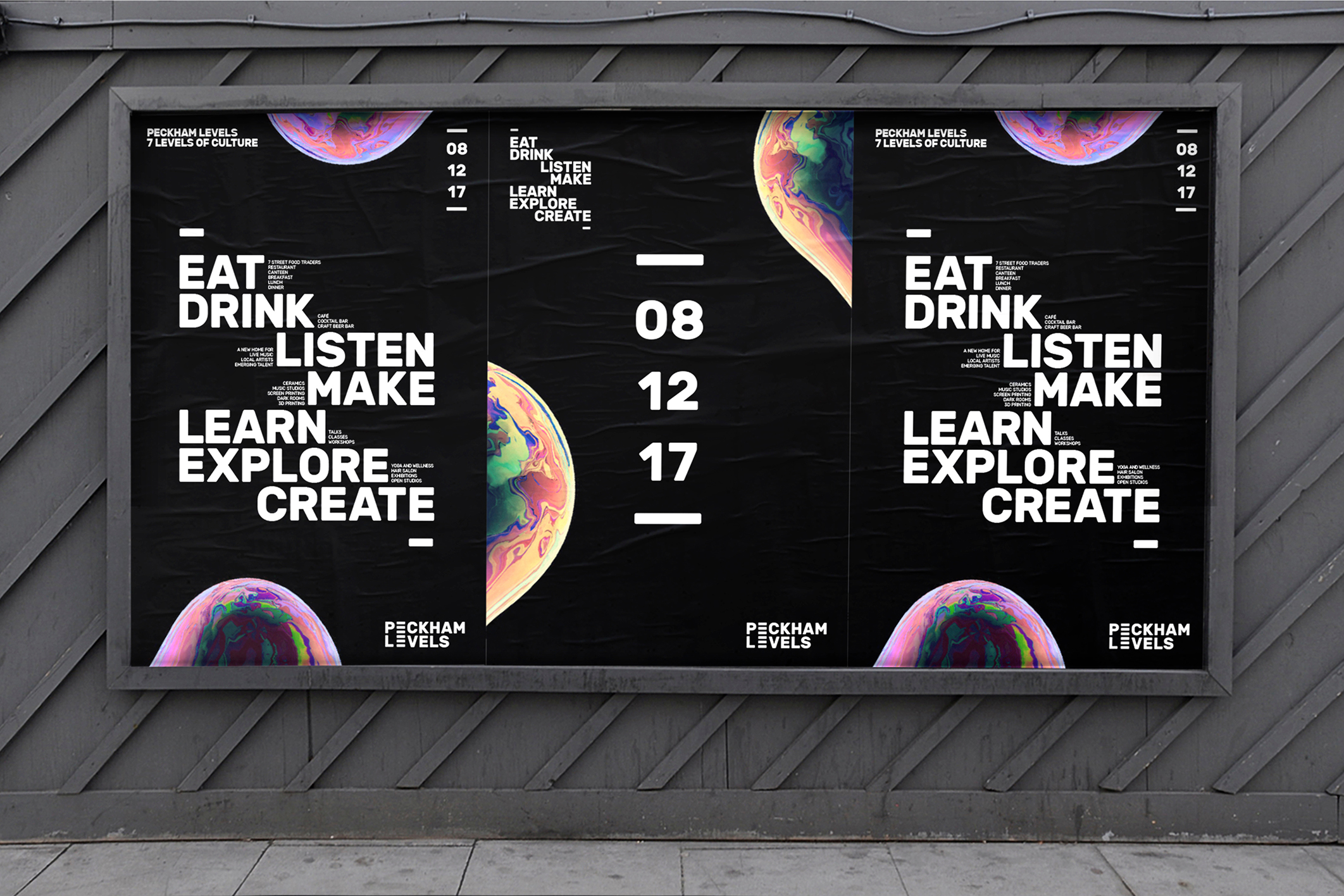
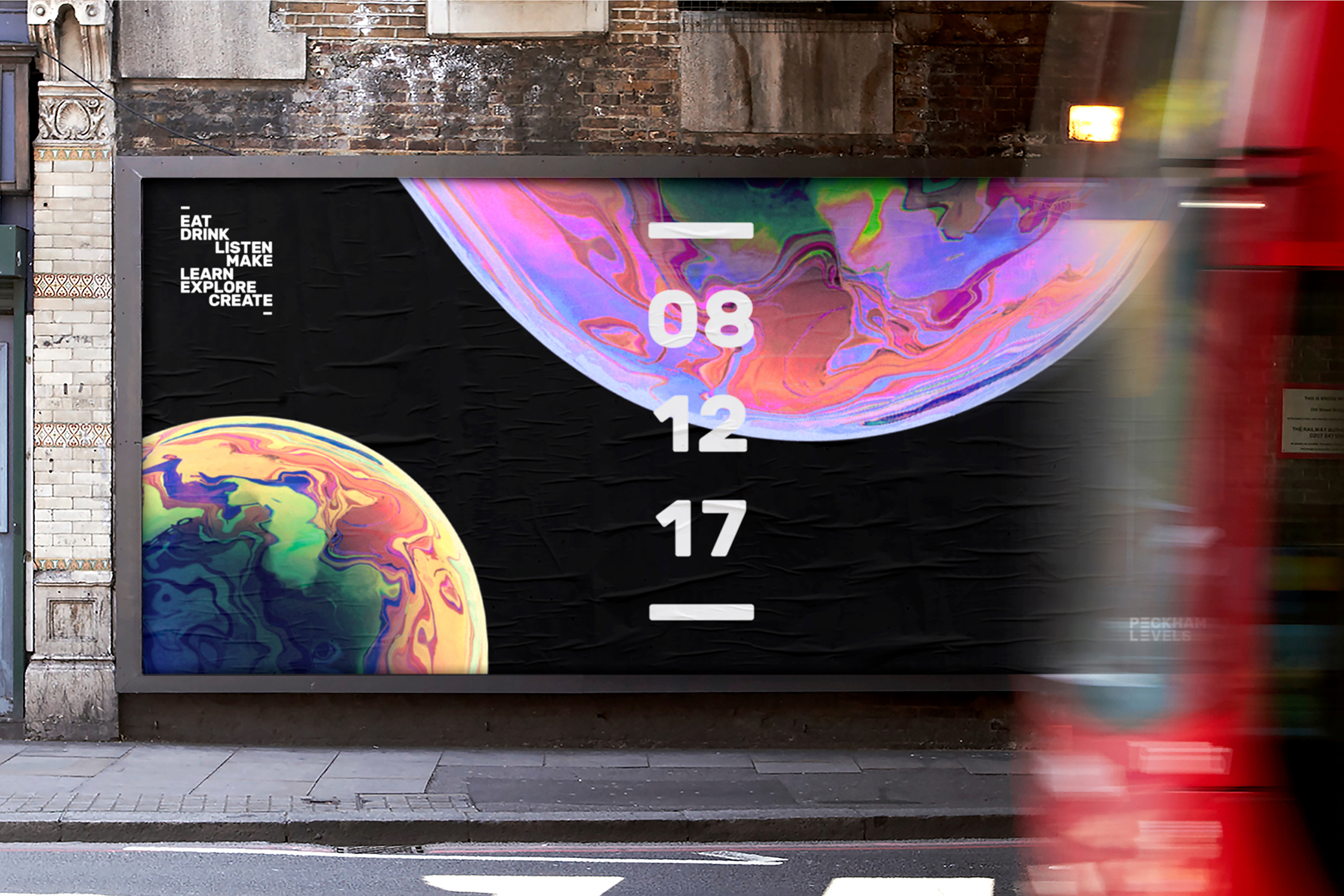
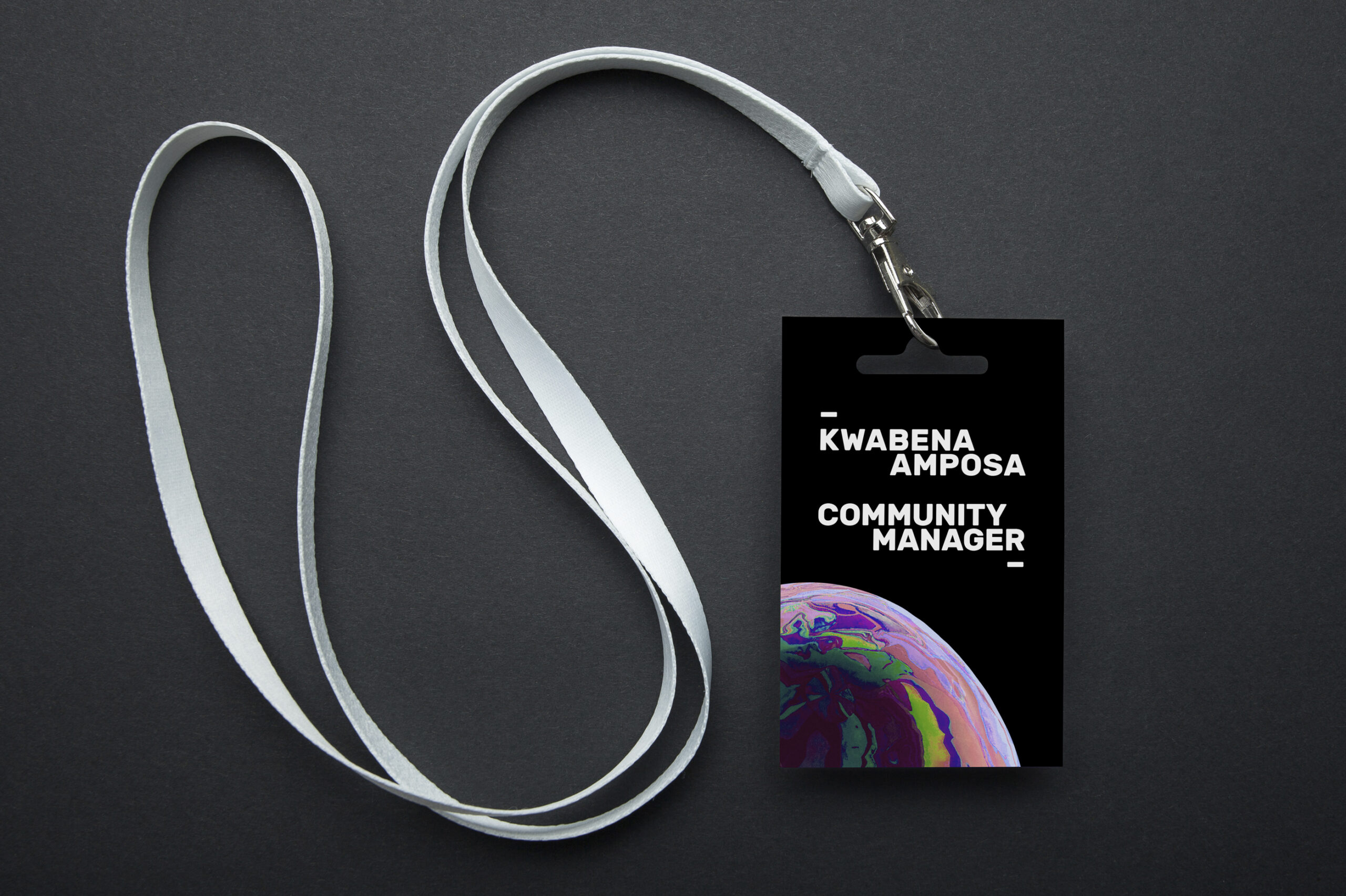
Peckham Levels
Out of home launch campaign for a cultural institution set across seven levels of a former NCP car park. We positioned PL around the idea – seven levels ‘Alive with culture’. An idea that celebrated the transformation of the building itself. This idea informed the design through staggered and stacked typographic device to reference the levels and flow of a multi-storey car park. This flexible structure was then used to inform what was on offer. The art direction features close-ups of multi-coloured CG bubbles that were commissioned to act as a metaphor for life and the diverse range of residents housed in the venue. The close crops look world-like also referencing how much there is to explore. View case study →
.001
Logo for Point Zero Zero One, a performancewear brand inspired by motorsport.
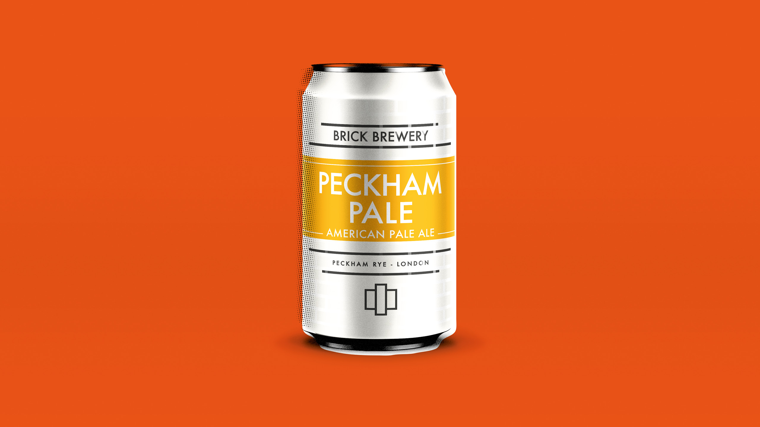

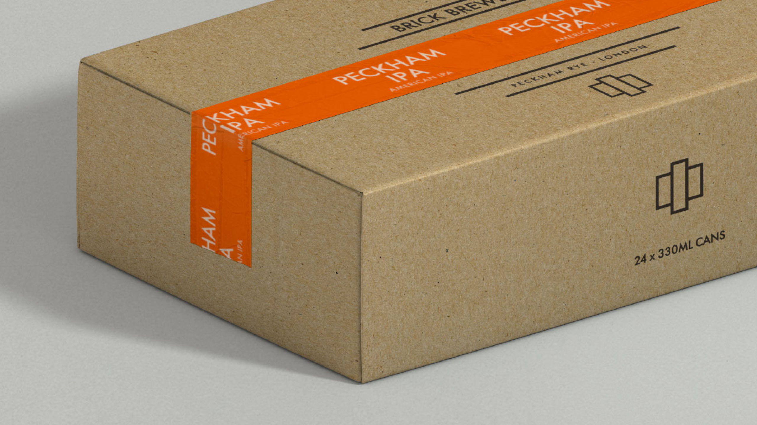
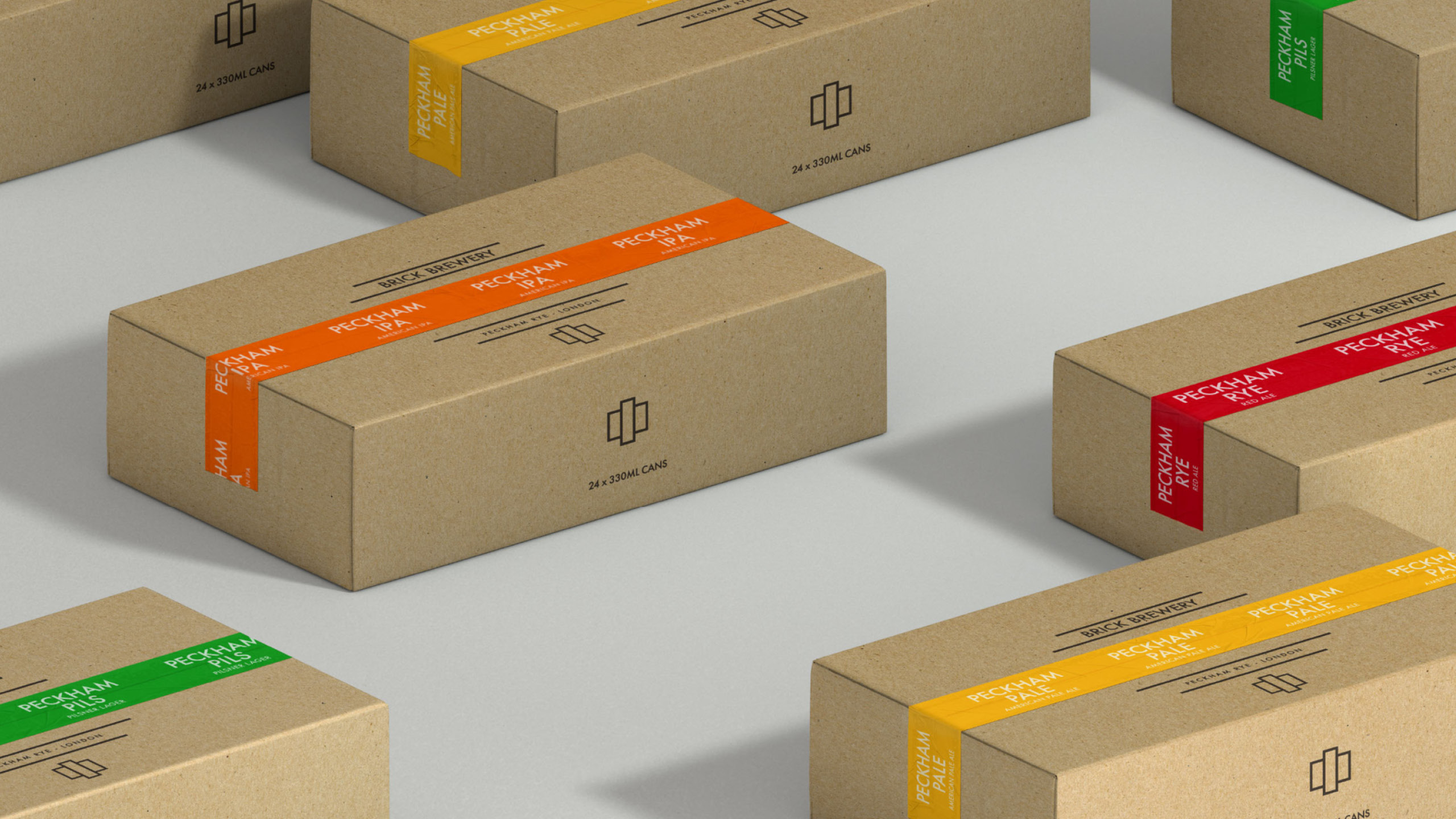
Brick Brewery
Brand development for Brick Brewery. We looked at extending the overall brand system, tactile on-can brickwork design, distribution packaging, vehicle livery, advertising and event stand dressing. The latter two based on a pop-art visual interpretation of the cans themselves. Built around the idea 'Elevating the popular'.
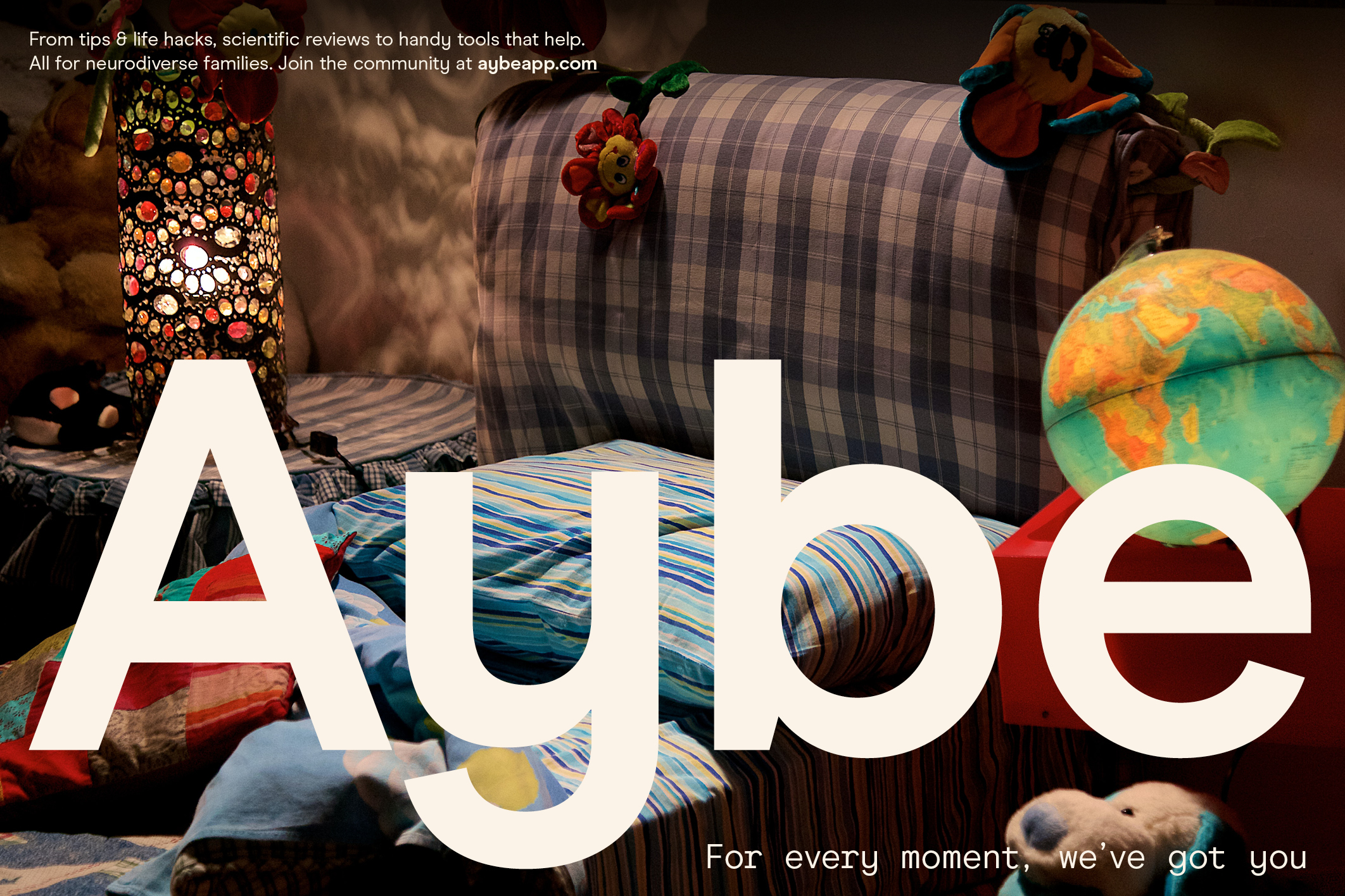
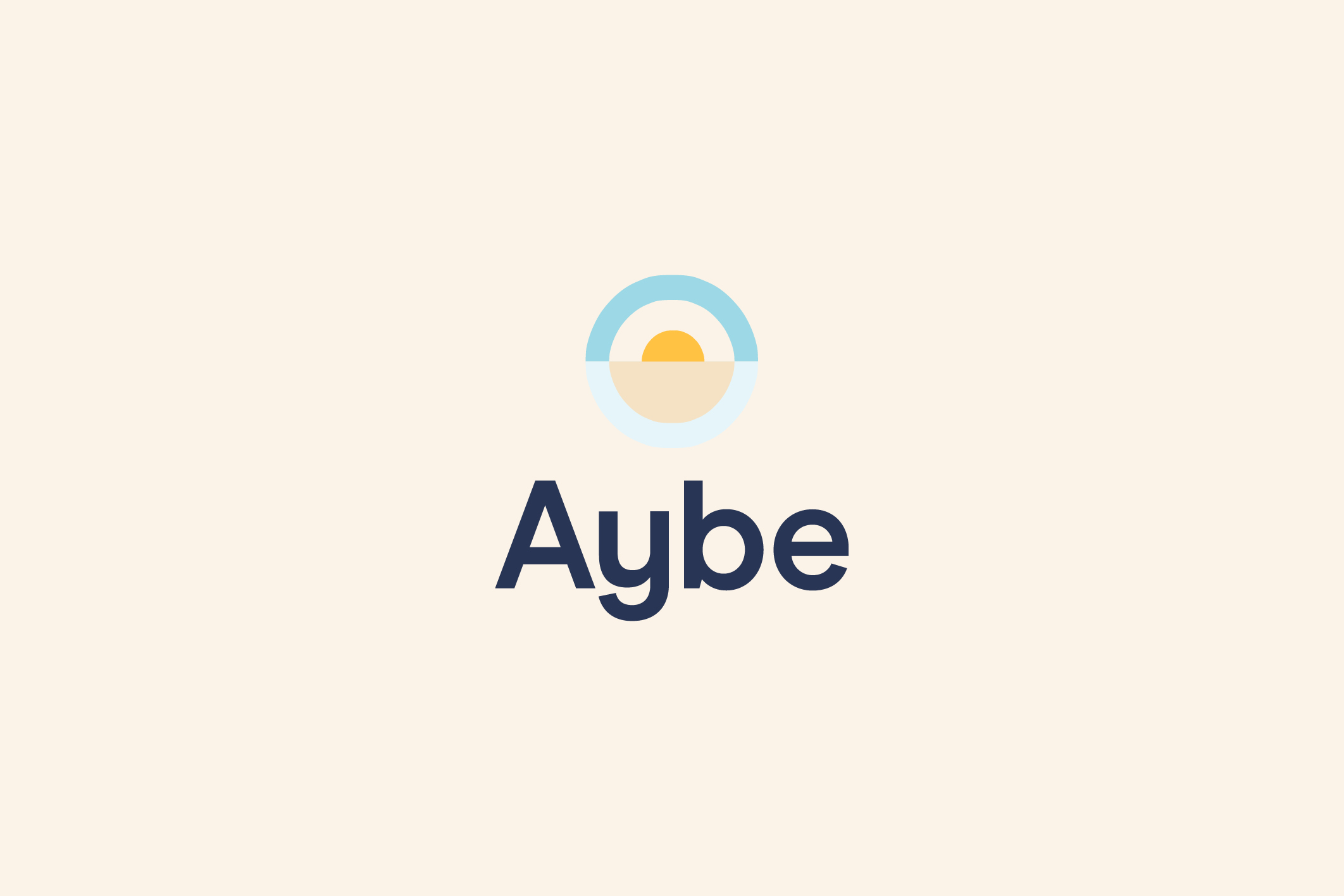
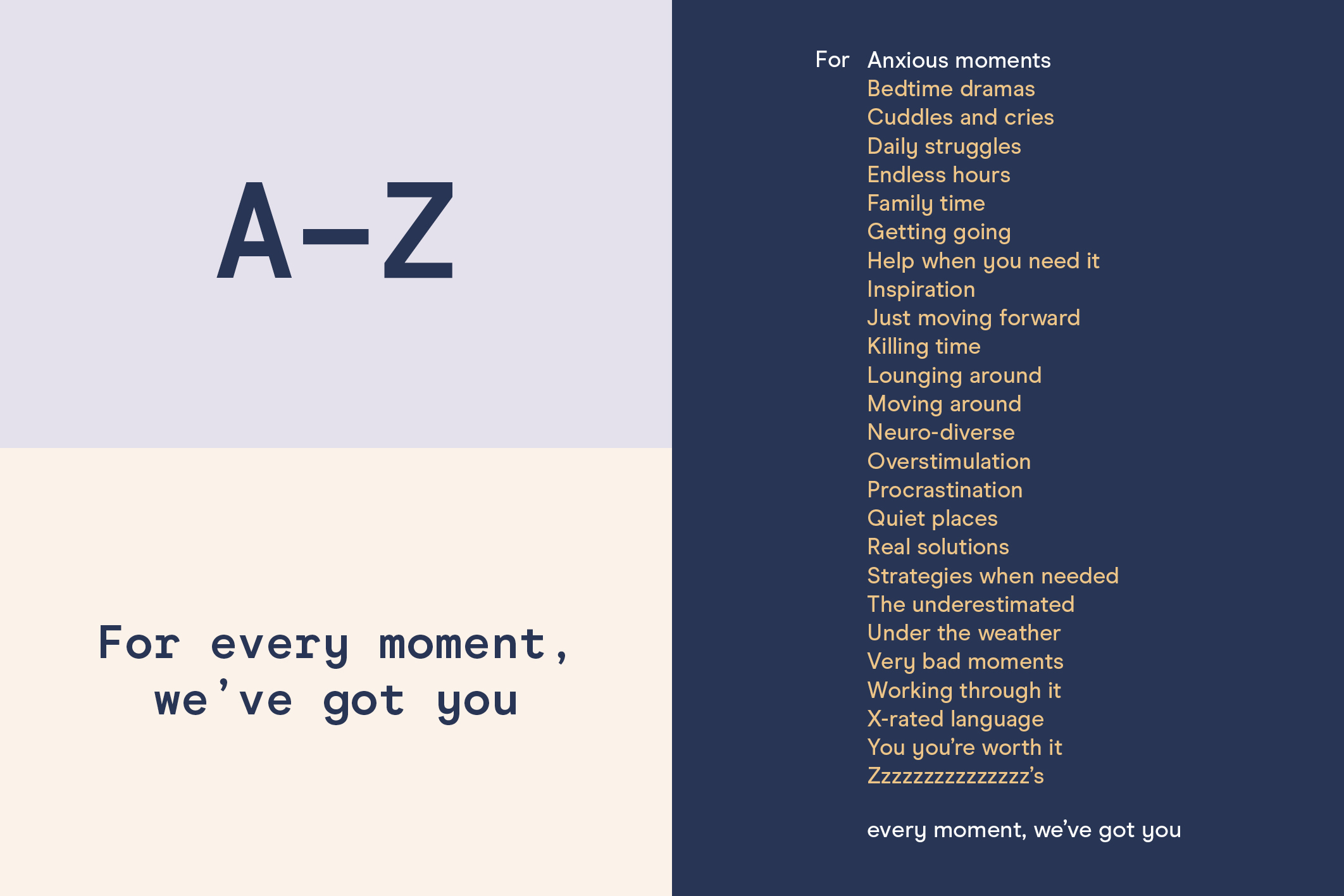


Aybe
Naming, brand identity and positioning for Aybe, an online community and app that provides evidence based tools and support for families with neurodiverse children. A platform designed for every moment.

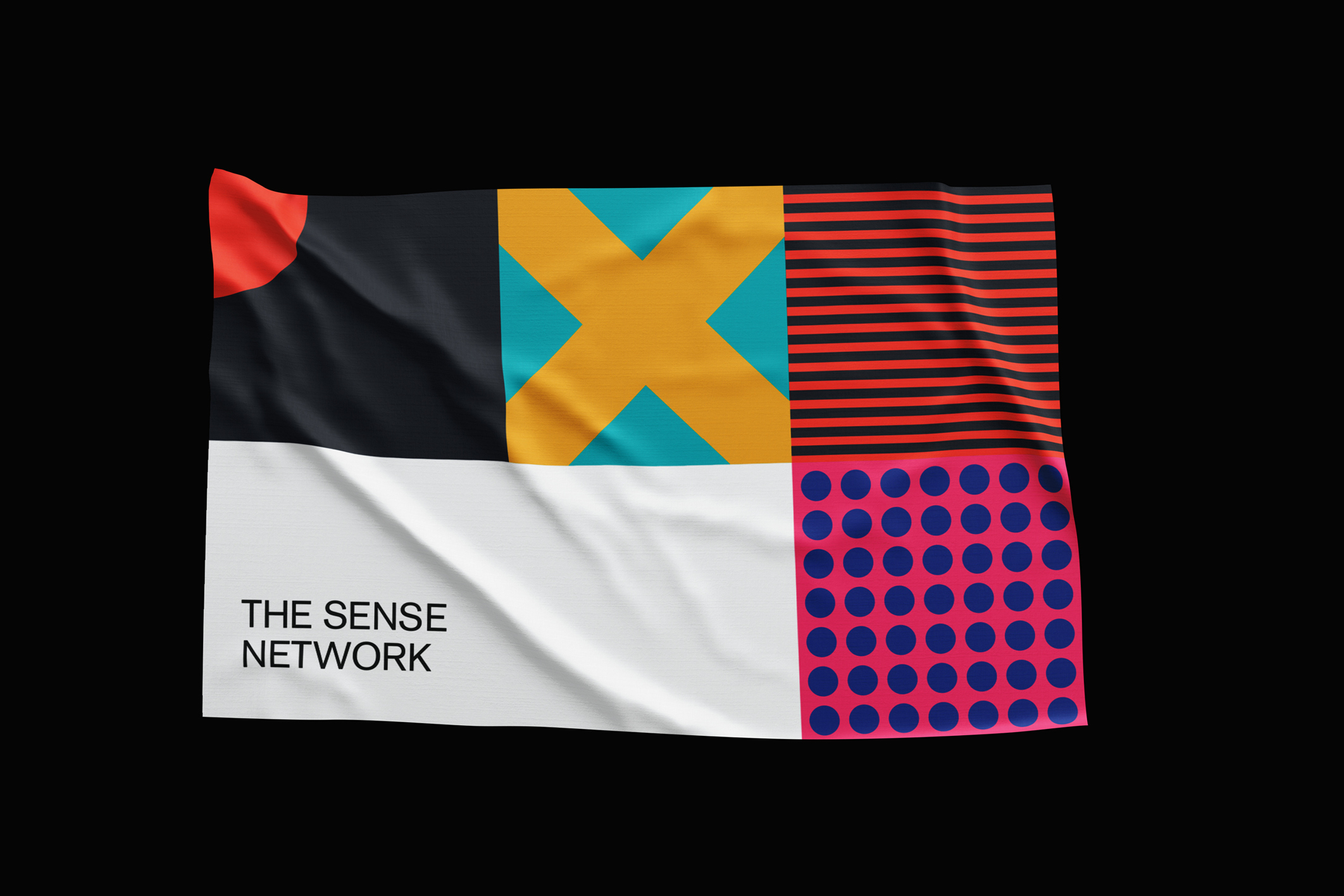


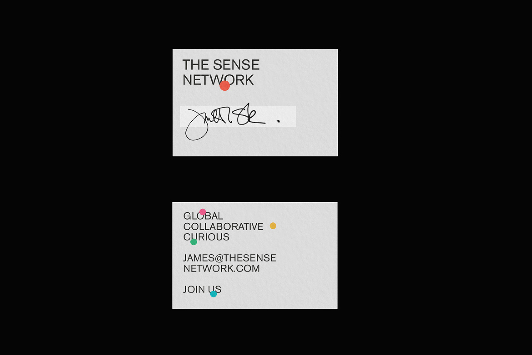
The Sense Network
Brand Identity for TSN, a creative intelligence network of 3000 people from diverse backgrounds, often working at the edges of culture.
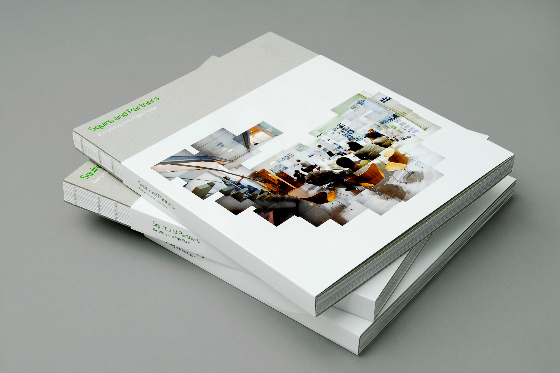
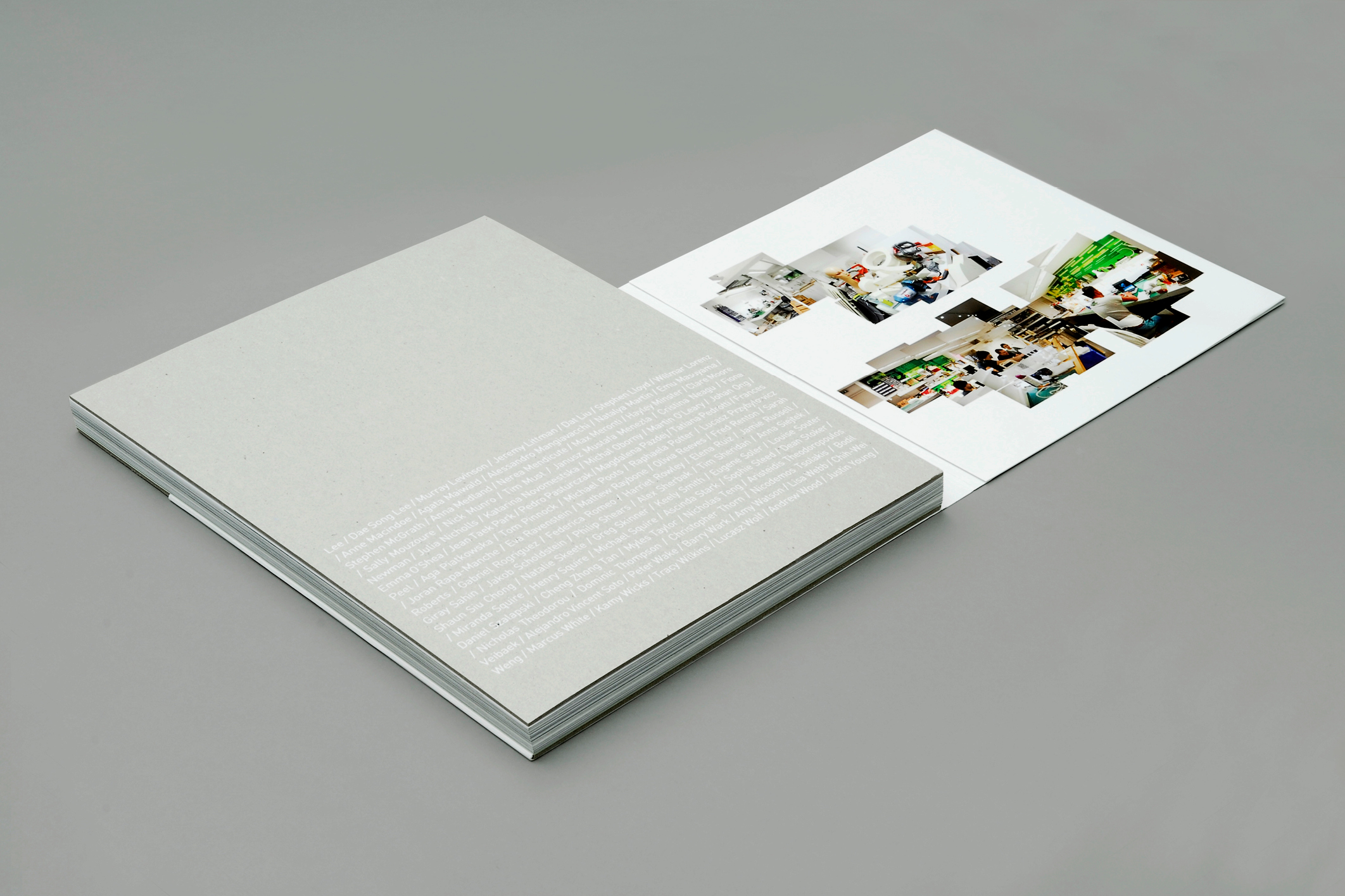

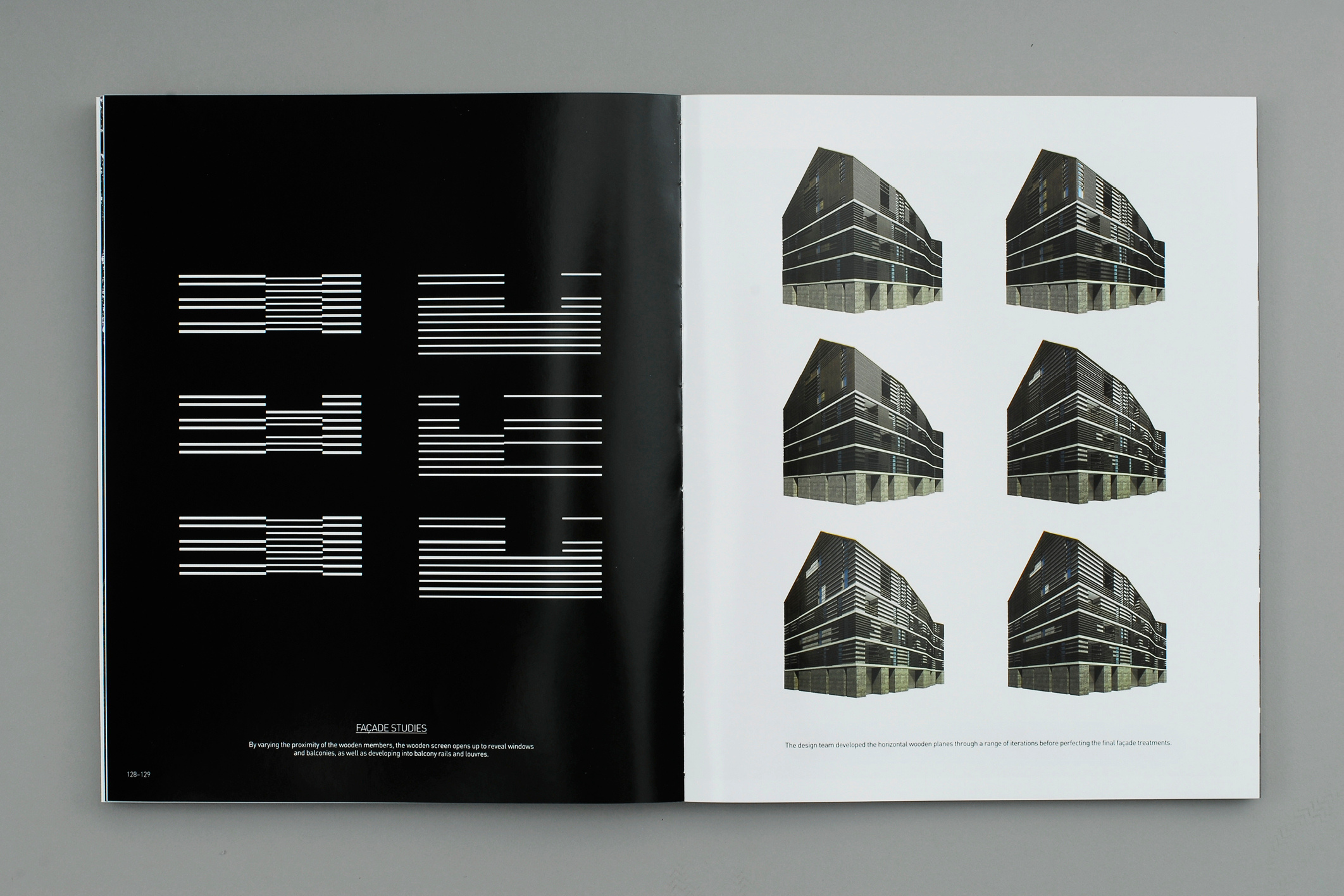
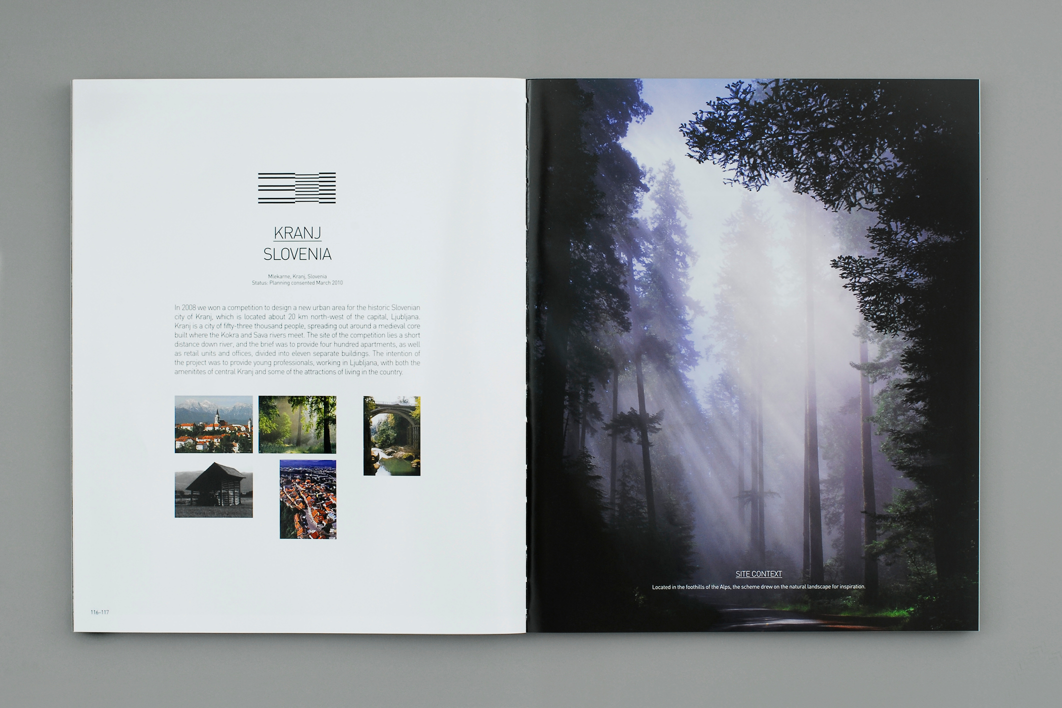
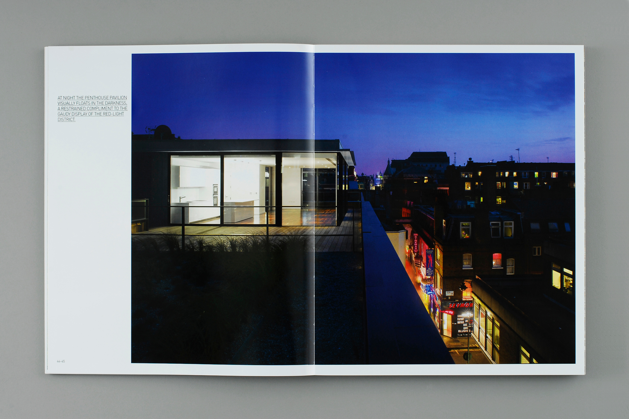
Squire and Partners
260 page book revealing the culture of this London based International practice. Named 'Everything in its Right Place' the outer features a 3/4 height gloss laminated jacket showing montage imagery inside the practice, and reveals the raw greyboard inner cover boards, allowing the section sewn binding to see seen. Beneath the cover jacket are the names of everyone that has ever worked there, white folied on the greyboard. The book details key projects and their workings - from sketches to final CGI's and and finished building photography. Inner workings and insights of the practice itself were threaded through the book. On the whole, the books intention was to announce a new direction for the practice, showcasing more diversity in projects. Studio shots by Will Pryce. Agency ©Mammal.
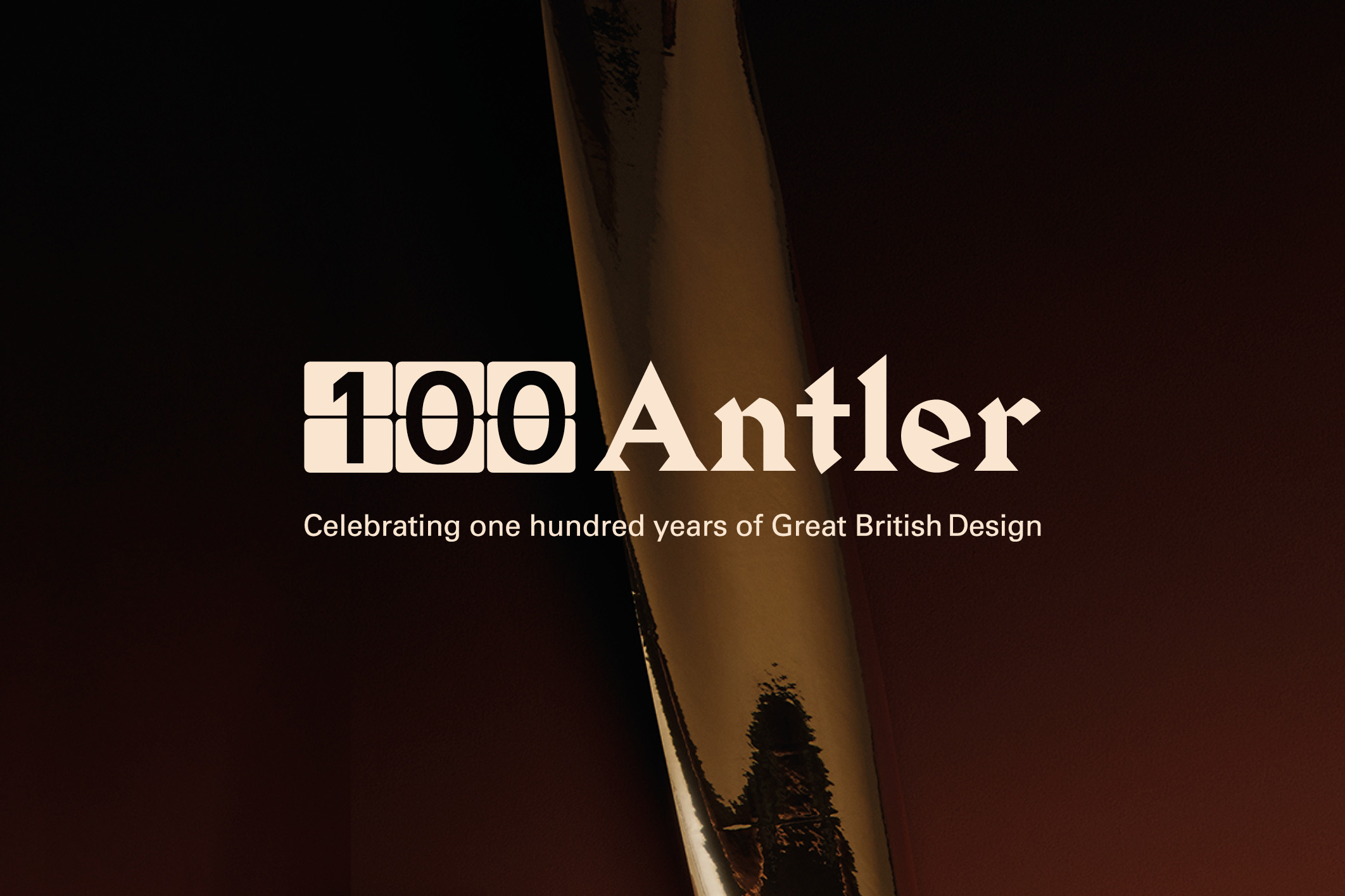
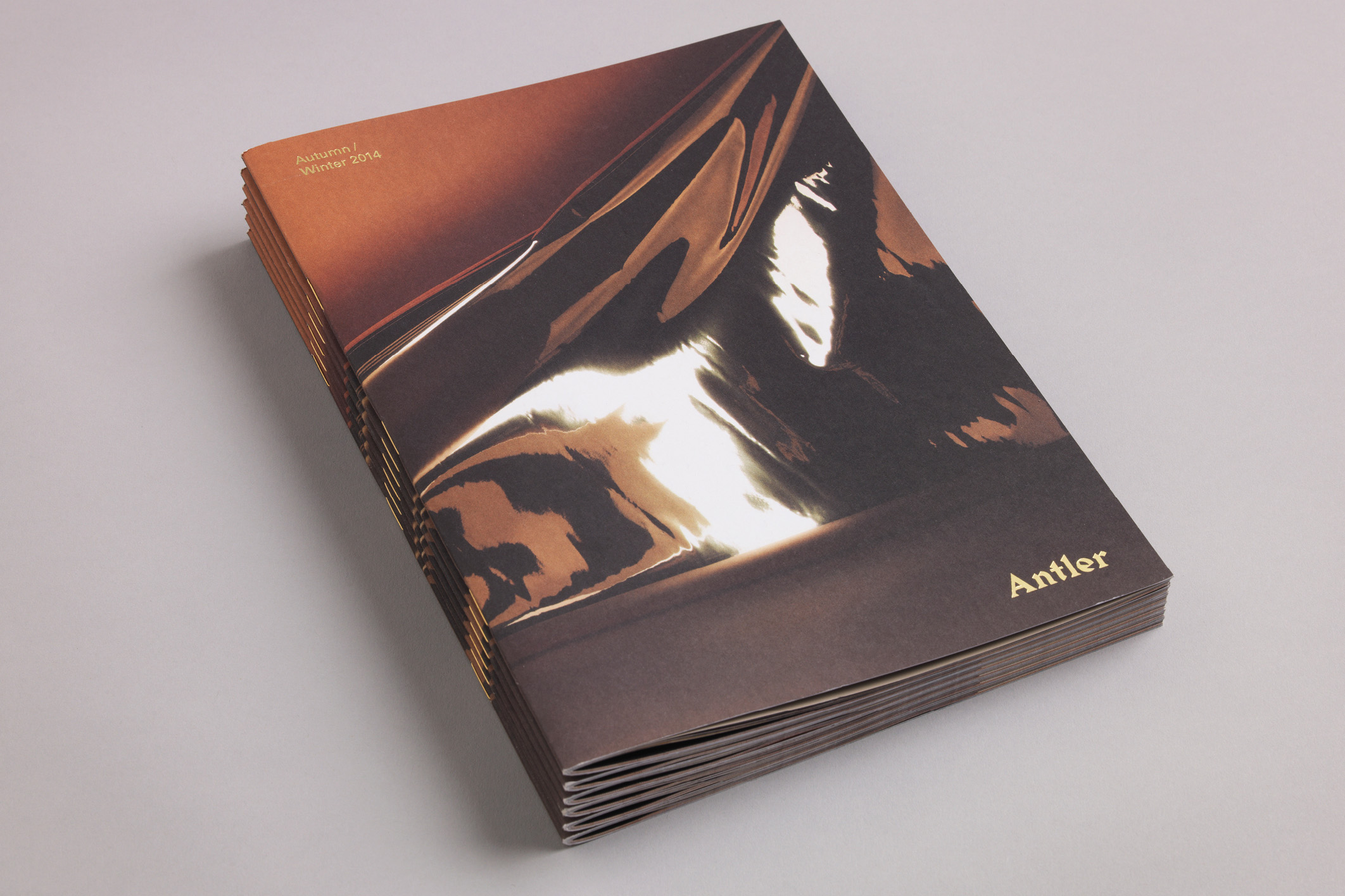
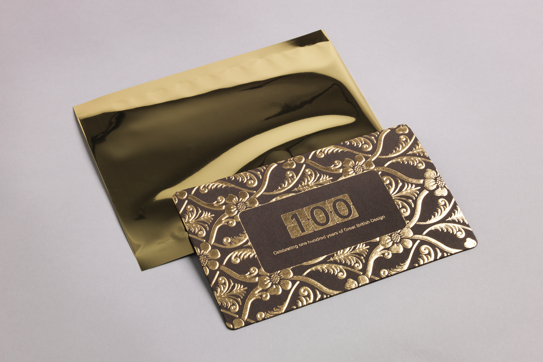
Antler 100 Campaign
Campaign celebrating 100 years of Antler. The creative follows a disco inspired direction, using a palette of gold, cream and brown to give a vintage feel, alongside a year-long bespoke logo lock-up featuring a 100 that references airport and station classic departure boards. The campaign ran online, in store, press and look book. Shot by Matthew Shave. ©Mammal.
A
B
O
U
T
RP©